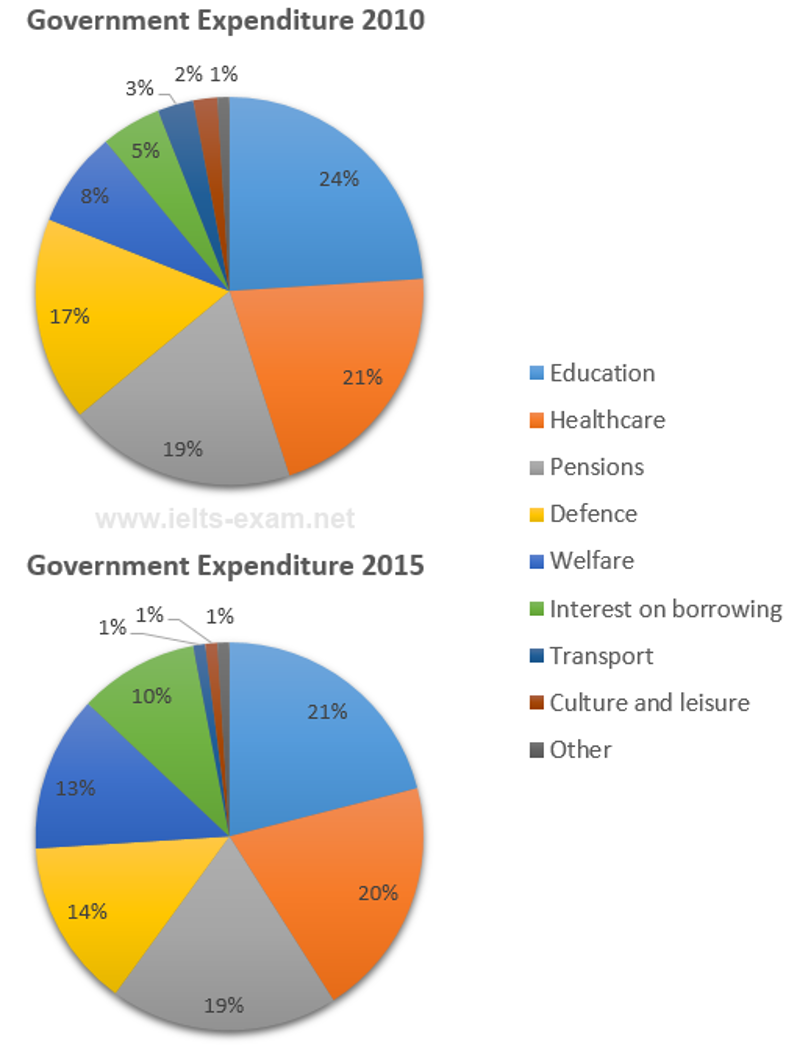
The charts below show local government expenditure in 2010 and 2015.
Summarise the information by selecting and reporting the main features, and make comparisons where relevant.
Write at least 150 words.
The given pie chart makes a comparison of the government's spending on nine various areas between 2010 and 2015.
It is clear that, while education accounted for the majority of the expenditure, others contained the lowest percentage in both years.
As can be seen from the chart, the four most enormous fields that the government spent were as follows: education, healthcare, pensions, and defence. Almost a quarter of expenditure was for education in 2010 and about one - fifth in 2015. The most striking point to note is that the figure for pensions was remained steady, at 19% in the following five years. At the same time, defence experienced a considerable drop from 17% to 14%.
Out of the nine areas, the proportion of welfare and interest on borrowing was the only which saw a dramatic rise, by exactly 5% from 8% and 5% respectively. On the other hand, transport, culture and leisure and other took up 6% of the expenditure in total in 2010, as doubled as the figure in the next five years.

Picture1.png
