Unanswered [1] | Urgent [0]
  

Home / Writing Feedback   % width   Posts: 2


The graph illustrates carbon dioxide emitted per person on average, in four different countries


blackjack 1 / 1  
Apr 13, 2021   #1

IELTS 1 - CO2 emissions per person


The graph below shows average carbon dioxide (CO2) emissions per person in the United Kingdom,Sweden,Italy and Portugal between
1967 and 2007.
Summarise the information by selecting and reporting the main features,and make comparisons where relevant.


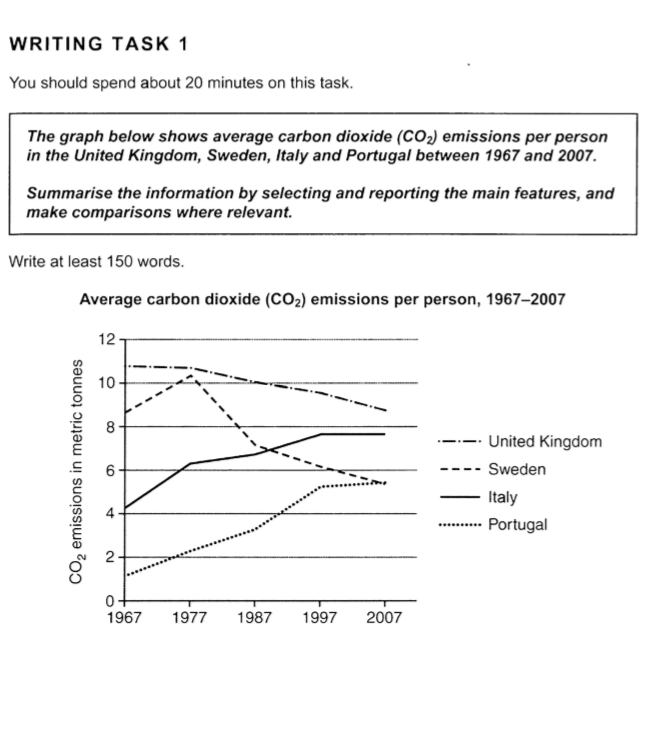
The graph illustrates carbon dioxide emitted per person on average in four different countries(UK,Sweden,Italy and Portugal) from 1967 to 2007,and it is measured in metric tonnes.

Generally,it can be seen that in the UK and Sweden,the average amount of CO2 emitted per person saw an overall downward trend,which,conversely,rised in Italy and Portugal.

To be more specific,in the UK,starting at around 11,the number stayed constant in the first ten years before it saw slight but consistent drop from 1977 to 2007,when it reached the lowest level ,at just below 9 metric tonnes.By comparison with the situation in the UK,in Sweden,despite the fact that the number peaked at over 10 in 1977 after commencing with approximately 9 metric tonnes in 1967,it dropped significantly to 7,and after that,the trend slowed down and hit a low of 6 in 2007.

However,there was an inverse trend in Italy and Portugal.The average CO2 emissions per person increased from 4 in 1967 to over 7.5 in 1997 before staying stable in the next ten years.The figure for that in Portugal had kept rising from 1967 ,at 1,to 1997,at 5,when it began to go up slightly and finally reached 5.5,exceeding the number of Sweden in 2007.

--------------------------------------------------------------
Please feel free to comment and if so, you can give me a band score. Thx!

Please contact us directly: essayforum.com@gmail.com for a band score.

  • Screenshot17.png


Holt  Educational Consultant - / 15385  
Apr 19, 2021   #2
The summary overview is a run-on presentation. The first sentence should have ended after the inclusive years were presented. The second sentence, referring to the measurement, is based on a different set of information. Hence, it requires its own sentence presentation. It is unrelated to the previous information so it cannot be presented using the word "and" due to thought clarity requirements.

There are points of criss-crossing information in the presentation between Sweden, Italy, and Portugal that should have been referred to in the essay as a part of analyzing the information in an important and notable manner. These points of intersection help show a true review of the image.

You tend to use run-on sentences throughout the presentation,causing undue stress for the reader. Expect this practice to reduce your GRA and C&C scores in the actual test due to the confusing / difficult to follow information presentation. Use more periods than commas to indicate a change in sentence idea or information presentation.

* Limited free review presentation due to band score requirements. Contact us privately for scoring needs.


Home / Writing Feedback / The graph illustrates carbon dioxide emitted per person on average, in four different countries
Do You Need
Academic Writing
or Editing Help?
Fill out one of these forms:

Graduate Writing / Editing:
GraduateWriter form ◳

Best Essay Service:
CustomPapers form ◳

Excellence in Editing:
Rose Editing ◳

AI-Paper Rewriting:
Robot Rewrite ◳

Academic AI Writer:
Custom AI Writer ◳