The graph illustrates the fish, lamb, beef and chicken consumptions in an European country
Cambridge English IELTS 7. Test 2. Task 1.
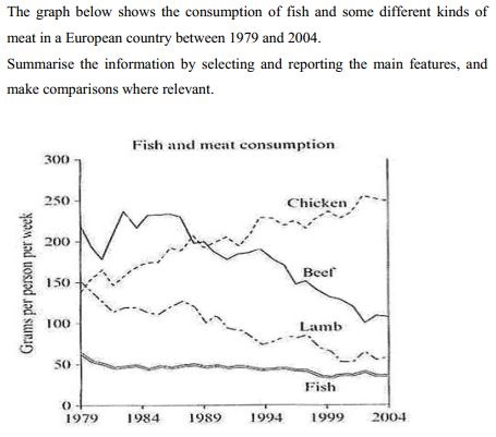
The graph illustrates the fish, lamb, beef and chicken consumptions in an European country from 1979 to 2004.
There were a significant rise in the amount of chicken consumed and a steep decrease in beef and lamb consumptions. Meanwhile, the consumption of fish was stable during that time.
In 1979, beef was the most popular meat in this country. Between 1980 and 1986, the amount of beef consumed moderately fluctuated then rapidly declined: 220 grams and 100 grams per person per week respectively: 120 grams gone down.
At the beginning of the period, the chicken and lamp consumptions were quite the same : approximately 150 grams per person per week but these two features come to two different ways. The chicken consumption sharply went up to 250 grams for a person in a week: 100 grams per person per week rise. By comparison, the amount of lamb eaten remarkably dropped by a similar amount.
The amount of fish consumed had a slight unsteadiness with an inconsiderable slump over the 25 - year - period.
401.728.0_rdkm2vb8hx.jpg
Holt Educational Consultant - / 15994 Your summary overview should have provided an identification of the type of graph involved. In this case, the graph used was a line graph representing fluctuating consumption of various food products. There should have also been an identifier of the measurement data from the chart (grams per person per week) to help explain the way the information was collected and how the measurement data was used.
I feel that you did not do a very good job at rephrasing the original information. There are still too many of the original words used in your presentation that could indicate a cut and paste or memorized presentation to the examiner. I would have done it this way instead:
The provided line graph indicated the way that humans ate various meat products between the years of 1979 up to 2004. The consumed meat products were chicken, beef, lamb and fish. Measurement indicators used were based on the grams per week that a person consumed. The obvious trend for the food eaten was...
The overview needs to be highly specific, informative, and clearly presented so that your work will be seen as completely developed and comprehensive for scoring considerations.
Your trending statement is confusing as you have 2 trending statements presented. You have one as the last presentation of your summary overview, then another one for fish at the end of the report. That stand alone sentence should have been integrated into the previous paragraphs as that is not a trend but rather, a measurement report. So integrating it into the last paragraph would have been a better fit for your presentation.
The Task 1 essay is normally just a 3 paragraph presentation. So you do not need to aim for a 4th paragraph reference. The stand alone sentence would have been bad for your GRA score anyway because it showed that you were not able to use all the information to create another 3 sentence paragraph. Each paragraph needs 3-5 sentences so combining related information in one paragraph is acceptable.
I think the organization of paragraphs should be considered more carefully, as Holt has suggested. I would also recommend that you pay more attention to grammar; for example in para 2, it should be "there was" not "were". I'm not quite sure of the use of punctuation in the third paragraph, maybe the last colon should be a comma instead.
Wish you best luck with your exam.
| Home / Writing Feedback / The graph illustrates the fish, lamb, beef and chicken consumptions in an European country |
ⓘ Need academic writing help? 100% custom and human!

