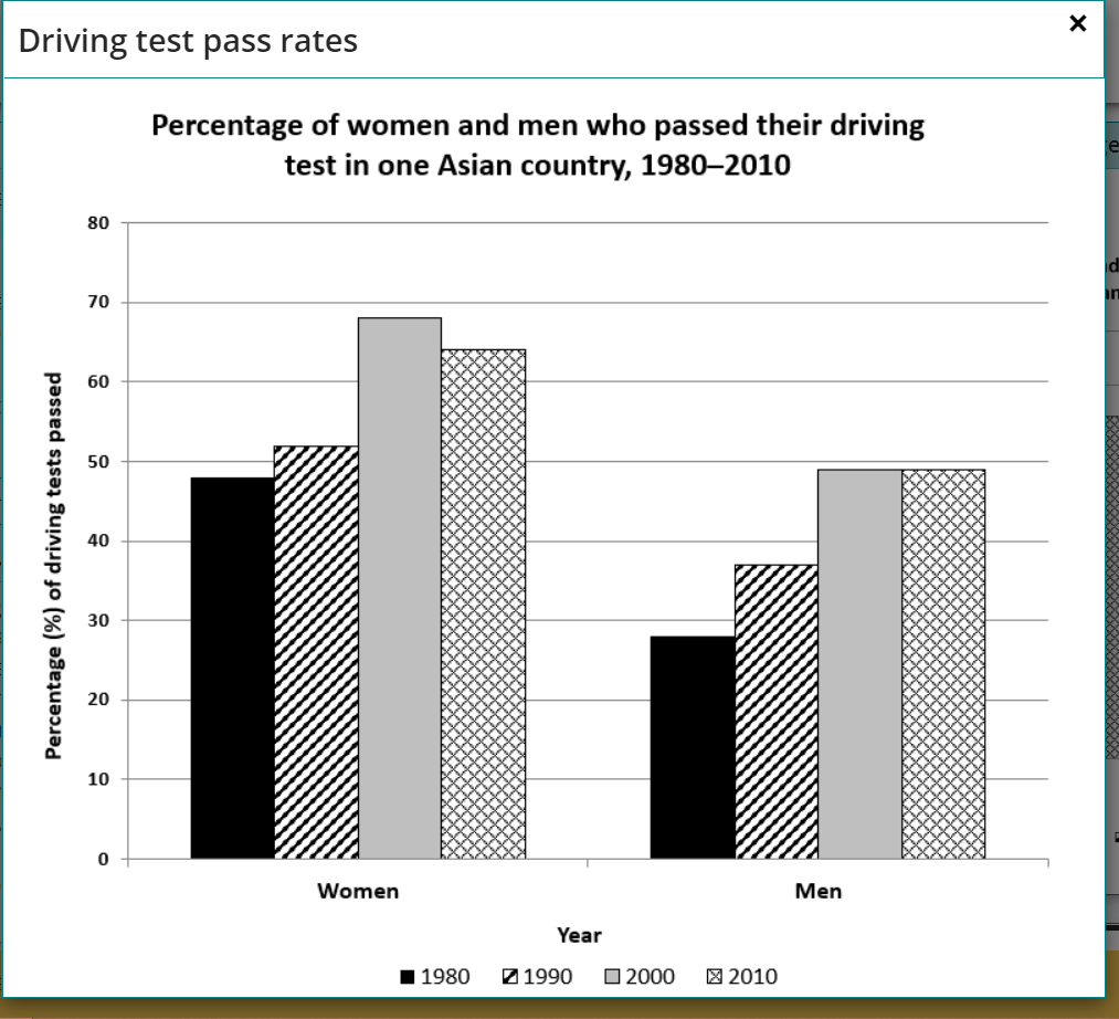
The chart shows the percentage of women and men in one Asian country who passed when they took their driving test between 1980 and 2010.
The graph illustrates the proportion of males and females passing the driving test from 1980 to 2010.
Overall, it can be seen that the driving test passed by women and men increased over the period. In addition, women passing this test higher than men on the given chart.
Looking at the chart in more detail, it is evident that the driving test pass rate of women stood at about 48% in 1980 and then rose to just around 50% in 1990. This figure then continued to go up significantly to nearly 70% in the next ten years, which was the highest point on the given graph. Subsequently, the proportion of passing rate driving test of females went down to approximately 64% at the end of the period.
Turning to the second data set, it is obvious that there was a dramatic increase in the percentage of men passing the driving test from about 28% in 1980 to around 38% in 1990. This figure then rose to just under 50% in 2000 and remain stable until the year 2010.
please give me the score in the IELTS test, my target is band 6.
Summarise the information by selecting and reporting the main features, and make comparisons where relevant.
The graph illustrates the proportion of males and females passing the driving test from 1980 to 2010.
Overall, it can be seen that the driving test passed by women and men increased over the period. In addition, women passing this test higher than men on the given chart.
Looking at the chart in more detail, it is evident that the driving test pass rate of women stood at about 48% in 1980 and then rose to just around 50% in 1990. This figure then continued to go up significantly to nearly 70% in the next ten years, which was the highest point on the given graph. Subsequently, the proportion of passing rate driving test of females went down to approximately 64% at the end of the period.
Turning to the second data set, it is obvious that there was a dramatic increase in the percentage of men passing the driving test from about 28% in 1980 to around 38% in 1990. This figure then rose to just under 50% in 2000 and remain stable until the year 2010.
please give me the score in the IELTS test, my target is band 6.

Capture.PNG
