IELTS 1
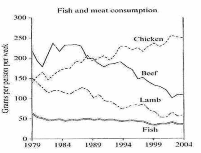
The graph below shows the consumption of fish and some different kinds of meat in a European country between 1979 and 2004.
(Write at least 150 words)
The graph illustrates how many grams were consumed weekly by European people on fish and three types of meat: chicken, beef, and lamb from 1979 to 2004.
Overall, there was an upward trend in the consumption of chicken as opposed to the data for lamb and beef. In addition, the lowest could be found in fish consumption.
Looking first at beef and lamb consumption, over 200 grams of beef were used by each individual per week at the beginning of the period, followed by the figure for lamb was 150 grams. Then, the amount of beef peaked at approximately 240 grams in 1984 before hitting a constant fall to around 100 grams in 2004. Meanwhile, the figure for lamb had a substantial decrease after 1979 and fell to its lowest point at around 50 grams in 2004.
Turning to the remaining figures, the amount of chicken consumed was accounted for just below 150 grams in 1979. After that, this number experienced a considerable increase to precisely 200 grams in 1989 and fluctuated slightly to end at around 250 grams in the last year. While the data of fish remained stable at approximately 50 grams throughout the period time.
The graph below shows the consumption of fish and some different kinds of meat in a European country between 1979 and 2004.
Summarise the information by selecting and reporting the main features and make comparisons where relevant.
(Write at least 150 words)
The graph illustrates how many grams were consumed weekly by European people on fish and three types of meat: chicken, beef, and lamb from 1979 to 2004.
Overall, there was an upward trend in the consumption of chicken as opposed to the data for lamb and beef. In addition, the lowest could be found in fish consumption.
Looking first at beef and lamb consumption, over 200 grams of beef were used by each individual per week at the beginning of the period, followed by the figure for lamb was 150 grams. Then, the amount of beef peaked at approximately 240 grams in 1984 before hitting a constant fall to around 100 grams in 2004. Meanwhile, the figure for lamb had a substantial decrease after 1979 and fell to its lowest point at around 50 grams in 2004.
Turning to the remaining figures, the amount of chicken consumed was accounted for just below 150 grams in 1979. After that, this number experienced a considerable increase to precisely 200 grams in 1989 and fluctuated slightly to end at around 250 grams in the last year. While the data of fish remained stable at approximately 50 grams throughout the period time.

task1cam7test2.pn.png
