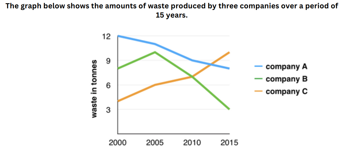
The line graph compares three companies in terms of waste output between the years 2000 and 2015.
It is clear that there were significant changes in the amounts of waste produced by all three companies shown on the graph. While companies A and B saw waste output fall over the 15-year period, the amount of waste produced by company C increased considerably.
In 2000, the amount of waste produced by company A started at 12 tonnes, after which it experienced a considerable fall to 10 tonnes in 2005 before ending the period at just under 9 tonnes. By contrast, only 4 tonnes of waste materials in 2000 in Company C, with a subsequent significant rise to 6 tonnes after 5 years and a final rocket to 10 tonnes
The figure for C climbed sharply from 8 tonnes at the beginning of the period to reach a peak of 10 tonnes but later rapidly declined to only 3 tonnes in the last years of the period examined

Screenshot2024072.png
