Unanswered [13] | Urgent [0]
  

Home / Writing Feedback   % width Posts: 3


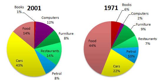
The graphs show changes in spending habits of people in UK between 1971 and 2001.


LinhLe32 1 / -  
Nov 7, 2018   #1
Please correct this essay for me. Thank you for your help!
You should spend about 20 minutes on this task.
Topic: The graphs show changes in spending habits of people in UK between 1971 and 2001.
Write a report to a university lecturer describing the data. (Image attached)
Write at least 150 words


difference in expenditure allocation in the UK


The pie charts compare the difference in expenditure allocation in the UK in the years 1971 and 2001 for seven categories.
It is noticeable that the patterns of the amount of money for books and food saw significant increases while the proportion of spending on cars, restaurants and computers increased substantially. On the other hand, there were small differences in the percentages of petrol and furniture consumption.

Food accounted for the highest proportion of UK spending in 1971 with 44%, but it saw a fall into 14% in 2001. Similarly, UK residents spent less money on books in 2001 with 1% comparing to this terms in 1971 with 6%. By contrast, it is clear that budgets for cars, restaurants and computers went up dramatically with 22%, 7% and 2% in 1971 to 43%, 14% and 12% respectively in 2001.

With regards to furniture and petrol, there were just minimal changes in household expenditure. In fact, furniture costs and petrol costs took roughly 9% and 10% of household budgets relatively in 1971 and the UK consumer just allocated 8% in their budgets for both these two types in 2001.

  • Task <>'" &'ss'>
HuongGiangNguyen 4 / 12  
Nov 7, 2018   #2
Dear Linh,
First, about "went up dramatically with", I think it should be "from".

Second, you should change the way of giving data, not just the raw statistics from the charts. For example, "but it saw a fall into" can be rewritten like "...it decreased by 30%..."

Finally, I love the way you paraphrase and use "respectively"
Holt  Educational Consultant - / 14,835 4783  
Nov 8, 2018   #3
Le, the presentation you are using can be really confusing to the reader because you are comparing the information per type in the same paragraph. For these presentations, since you are using 2 different images, it would be best to use 2 paragraphs to individually represent each graph. The fourth paragraph can then be used for any comparison points between the two images. So the presentation would be outlined as follows:

Analysis 1: 1971 pie chart using chart percentage information
Analysis 2: 2001 pie chart based on pie chart information
Analysis 3: Comparison points presentation using close numbered items such as books, computers, petrol. Use a measured discussion for the paragraph similar to the following:

There was a 2% increase in the petrol spending habits of people from 1971-2001. Along with that, there was a decrease of 5 percent for book purchases when comparing the 1971 expense to the 2001 book sales....

The difference in spending habits should be measured as per the difference in measurements in the third paragraph. Don't try to do it all in one paragraph, it confuses the reader. Task 1 essays require clarity in the data presentation because you are expected to analyze the given information for dissemination to your reader, who cannot see the pie chart for themselves.


Home / Writing Feedback / The graphs show changes in spending habits of people in UK between 1971 and 2001.
Writing
Editing Help?
Fill in one of the forms below to get professional help with your assignments:

Graduate Writing / Editing:
GraduateWriter form ◳

Best Essay Service:
CustomPapers form ◳

Excellence in Editing:
Rose Editing ◳

AI-Paper Rewriting:
Robot Rewrite ◳