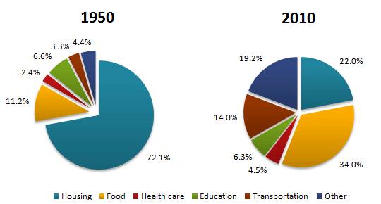
The pie charts below show the average household expenditures in a country in 1950 and 2010.
Summarize the information by selecting and reporting the main features, and make comparisons where relevant.
The provided pie charts illustrate the comparison of expenses in goods and services in the country over six decades. As it observed from the data, the most money spent on housing in 1950, whereas in 2010 there we some significant differences of all the selected categories.
92.1% of Housing was the largest proportion of expenditure in 1950, but by 2010 it decreased dramatically to 22.0%. The second expenditure by people in 1950 was food with 11.2%, however in 2010 money spent on food was rocketed as the highest expenditures of the household categories. In the term of other purposes experienced dramatic increase from 4.4% to 19.0% over the period.
There was no notable improvement in health care and education sectors. Over sixty-year period the expenditure in transportation inclined 2.1 per cent, and education declined 0.3 per cent. The last but not least, transportation was the other sector that showed that significant increase about 10.4 per cent than its percentage in 1950.

14731146_12982560468.jpg
