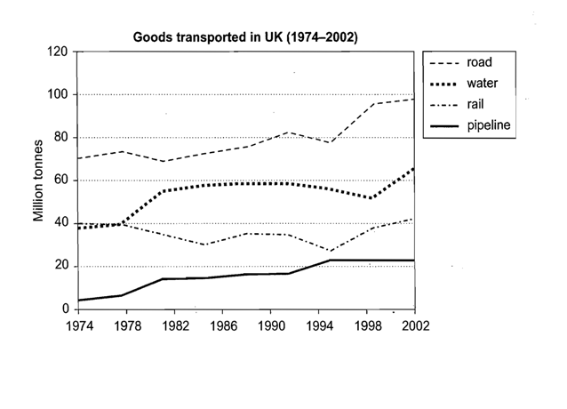
This line graph illustrates how goods distributed in the UK using four different kinds of transport between 1974 and 2004, measured in million tonnes. Overall, it can be seen that people are more likely to use road transportation to distribute goods. Likewise, the figures of road, water and pipeline transportation record a gradual increase, except the rail transport. If compared to all means of transport, road transportation experiences the highest tonnes in delivering goods during the period.
At a glance, the trend of road transportation use showed a significant rise from 1974 to 1986. On the other hand, 1974 to 1986 witnessed a decrease in the number of goods transported using rail transportation. It was around 40-to-30 million tonnes goods distributed using rail transportation, which was a fall during the first 12-year period. At the same period, statistic described an increase in the number of goods distributed through pipeline and water transportation.
Turning to the data for goods distribution using road transportation increased between 1990 and 2002 and peaked at approximately 95 million tonnes. 1990 to 2002 saw an increase in the number of water transportation use standing at 65 million tonnes. The number of goods distributed using pipeline rose by some 21 million tonnes in the last 16-year period . Interestingly, even though there was a fluctuation in the rail transportation use, there were about 40-to-40 goods distributed over the period (from 1974 to 2002), which means the number remained same in the beginning and the last period.

imo.png
