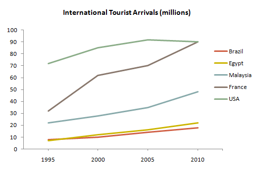
The graph below gives information about international tourist arrivals in five countries.
A breakdown of the figure for international tourist coming in five different countries, measured in millions, over a period of 15 years is shown in the line graph. Overall, it can be seen that total tourist arrivals increased from 1995 to 2010. We can also see that all countries got the highest arrivals in 2010 except the USA.
In 1995, around 70 million visitors come to the USA while the figure of France stood at around a half of that amount. The tourist coming to Malaysia was at just above 20 while Egypt and Brazil stood at relatively the same number in just below 10.
Between 1995 and 2010, it can be seen that the number of visitors coming to the USA was relatively the highest among other countries although 2010 saw the same number between France and the USA. It was caused by the significant increase of France, jumping from just above 30 to around 90. There was a steady growth to around 50 for Malaysia while Brazil and Egypt remained the same below 25.
(176 Words)

atugas.png
