Hi, this is my writing. Thank all the contributors for commenting on my essay!
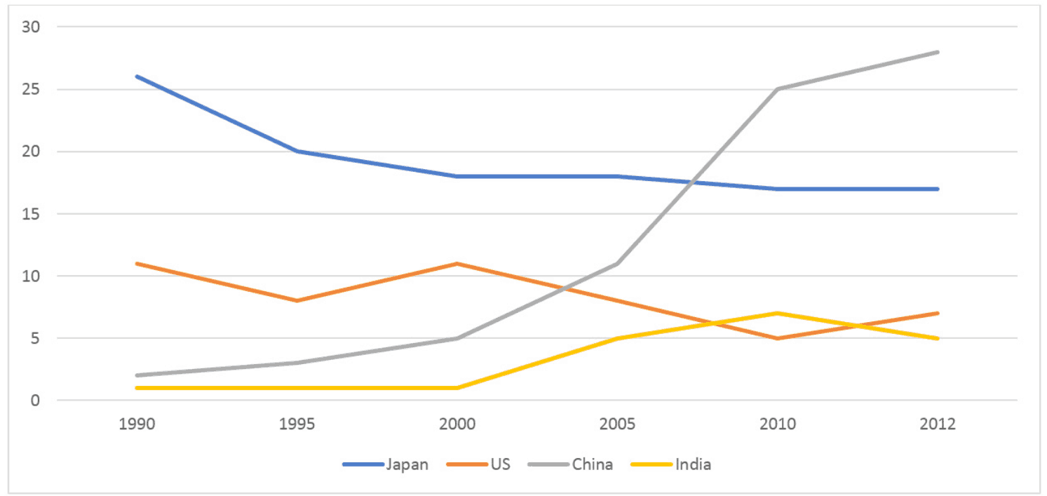
The line graph compares and contrasts data on the changes in the proportion of Australian international exports to 4 distinctive countries over a 23-year period.
In general, while Japan and US tended to import less from Australia during the research timescale, figures for China and India registered an opposite trend. Another striking feature is that Australia export the least to India over the period.
A closer look into the graph reveals that Japan initially imported the most from Australia in 1990, with a percentage of approximately 26 percent. Its reading fell slightly until 2005, where it started fluctuating and ending up at around 18 percent in 2012. Similarly, readings of the US began at about 11 percent, then dropped marginally over 5 years, and in the remaining years it constituted nearly 7 percent of exports from Australian.
As regards China, although its percentage of Australian imports began at about 3 percent in 1990, its records rose significantly over time and reached its peak in 2012 at about 28 percent. The figure for India, however, remained the smallest throughout the period, starting in the vicinity of 1 percent and finishing at roughly 5 percent.
(193 words)
The graph below shows the percentage of Australian exports to 4 countries from 1990 to 2012
The line graph compares and contrasts data on the changes in the proportion of Australian international exports to 4 distinctive countries over a 23-year period.
In general, while Japan and US tended to import less from Australia during the research timescale, figures for China and India registered an opposite trend. Another striking feature is that Australia export the least to India over the period.
A closer look into the graph reveals that Japan initially imported the most from Australia in 1990, with a percentage of approximately 26 percent. Its reading fell slightly until 2005, where it started fluctuating and ending up at around 18 percent in 2012. Similarly, readings of the US began at about 11 percent, then dropped marginally over 5 years, and in the remaining years it constituted nearly 7 percent of exports from Australian.
As regards China, although its percentage of Australian imports began at about 3 percent in 1990, its records rose significantly over time and reached its peak in 2012 at about 28 percent. The figure for India, however, remained the smallest throughout the period, starting in the vicinity of 1 percent and finishing at roughly 5 percent.
(193 words)

18_07_2019_theperce.png
