Unanswered [1] | Urgent [0]
  

Home / Writing Feedback   % width   Posts: 4


The line graph illustrates both fossil fuel energy and clean energy consumption in the USA


Kiu1007 3 / 5  
Aug 4, 2021   #1

report about consumption of energy


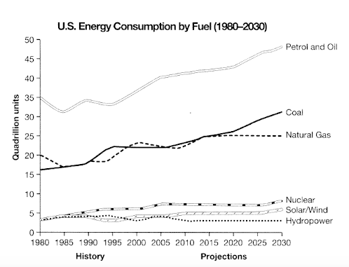
The line graph illustrates both fossil fuel energy and clean energy consumption in the USA started from 1980 with predictions until 2030.

Overall, fossil fuel energy (Petrol and Oil, Coal, Natural Gas) were widely used then clean energy and had experienced a moderate growth within the period. In contrast, clean energy (Nuclear, Solar wind, Hydropower) rarely consumed, fluctuated throughout the period.

Petrol and Oil started at 35 quadrillion unit fluctuated until 1995 followed by a gradual rise and is assumed to continue. Likewise, coal and natural gas started at 15 and 20 respectively. Natural gas fluctuated and reached a plateau just under 25 in 2015, while coal slightly increase after 2015 and is predicted to reach 30 in 2030.

On the other Hand, clean energy stood just under 5 in 1980, fluctuated until 2005, Hydropower experienced a mile declination and stayed constant at about 3 units in 2010. Nuclear rose moderately and expected to exceed 5 units in 2030.

  • ielts_academic_writi.png


Holt  Educational Consultant - / 15384  
Aug 12, 2021   #2
The report, makes sense even though the writer has problems with word usage and sentence formation. Where the writer was ultra-focused on word usage in the previous task exercise, he seemed not to care about his written presentation this time around. There is a clear lack of editing and correction application in the presentation. The mistakes are enough to cause severe penalties in at least 3 scoring sections. Perhaps the writer wanted to fail in this exercise. He just did not care about getting a good score this time. It is evident that he needs to develop his homonym usage skills to allow for better sentence structure, development, and presentation.
hahalolo 1 / 5  
Aug 21, 2021   #3
It is recommended that you indicate the report of the past in the first graph, and the prediction in the second graph to keep it coherent.

As one of the tasks in Writing task 1 is make comparisons where relevant, you must clarify the different between figures, not describe them separately.
For instance, you can compare the amount of energy consumed in 1980 (in 1980, petrol and oil was the dominant type of energy with..., followed by natural gas and oil, ect) instead of indicate them one by one like Petrol and Oil started at.
Chubii 1 / 2  
Aug 21, 2021   #4
feedback of ost is really useful which helps me in writing so much


Home / Writing Feedback / The line graph illustrates both fossil fuel energy and clean energy consumption in the USA
Do You Need
Academic Writing
or Editing Help?
Fill out one of these forms:

Graduate Writing / Editing:
GraduateWriter form ◳

Best Essay Service:
CustomPapers form ◳

Excellence in Editing:
Rose Editing ◳

AI-Paper Rewriting:
Robot Rewrite ◳

Academic AI Writer:
Custom AI Writer ◳