Unanswered [0] | Urgent [0]
  

Home / Writing Feedback   % width   Posts: 6


The line graph illustrates how people consumed fast food in UK per week


HunT 2 / 2  
Mar 28, 2020   #1

Writing task 1(Line graph)


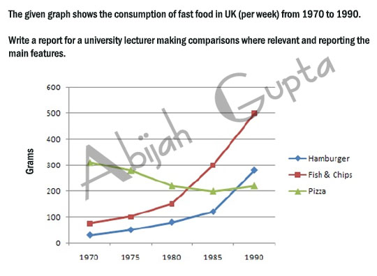
The line graph illustrates how people consumed fast food in UK per week over a course of 20 years starting from 1970.
Overall, as can be seen clearly that there was a significant increase in Fish & Chips's and Hamburger's consumption. While Pizza witnessed a modest decline over the timescale which made up the highest consumption at first.

Looking at the details, in 1970, the consumption of Pizza was the most, at over 300 grams per week, which was more than more 200 grams that of Fish & Chips and was over 6 times as much as Hamburger's one. However, time registered a slight decrease in the consumption of Pizza, with just more than 200 grams being eaten per week.

On the other hand, it was over 2 decades later that the figure for Fish & Chips overtook Pizza's and then became a new dominant fast food type, at 500 grams per week in 1990. After that was the number for hamburger which also experienced a sharp increase, at around 300 grams at the end of examined period.


  • fastfooduk_task1.jpg

  • fastfooduk_task1.jpg


Holt  Educational Consultant - / 15342  
Mar 28, 2020   #2
Your summary overview is not totally informative. When providing the years indicated in the graph, don't just give the start year. give the ending year as well. More importantly, before you present the trending sentence, make sure to indicate when measurement type was used. Remember, the summary is meant to prepare the reader for the information you will be discussing in the report. So providing a clue as to every topic is important. It helps the reader know what to expect and what information will be important to take note of.

Try to provide a 3 sentence minimum per paragraph. What I noticed is that you forgot to do comparisons where relevant in the presentation. There was a certain point where the pizza information overlapped with the hamburger and fish information. However, this overlapping information was not present in your report. Why is that? This created an incomplete representation on your part. The data presentation instruction clearly expected you to see the overlapping information because it asked you to "make comparisons where relevant".
TaraAryal23 4 / 12  
Mar 31, 2020   #3
@HunT
Analyze lowest and highest point while you come to encounter the trend related information
Evi_Nurliza 1 / 2  
Mar 31, 2020   #4
hi.. i wanna give an additional suggestion for you.
it is about the overlapping. that's so interesting as a key feature to write and it has 2 overlapping that have same number.
Thangnguyen315 8 / 24  
Apr 2, 2020   #5
I think there are some grammar mistakes in your writing, you should pay atten tion to such mistakes carefully before other criterias
tung53202 3 / 4  
Apr 3, 2020   #6
the UK
more than more
as much as of Hamburger's one
end of the examined period
over a course of -> over/for a course of (you should know that simple is the best!)
I hope you can improve your grammar and get the 9 score in the IELTS exam <3


Home / Writing Feedback / The line graph illustrates how people consumed fast food in UK per week
Do You Need
Academic Writing
or Editing Help?
Need professional help with your assignments? Fill out one of these forms:

Graduate Writing / Editing:
GraduateWriter form ◳

Best Essay Service:
CustomPapers form ◳

Excellence in Editing:
Rose Editing ◳

AI-Paper Rewriting:
Robot Rewrite ◳