Unanswered [2]
  

Home / Writing Feedback   % width   Posts: 2


The line graph illustrates how many tourists made a visit to an island in Caribbean from 2010 - 2017


levyxyz 1 / -  
Jan 12, 2022   #1

Caribbean island tourists


This is my task 1. Please check it for me. Thank you.
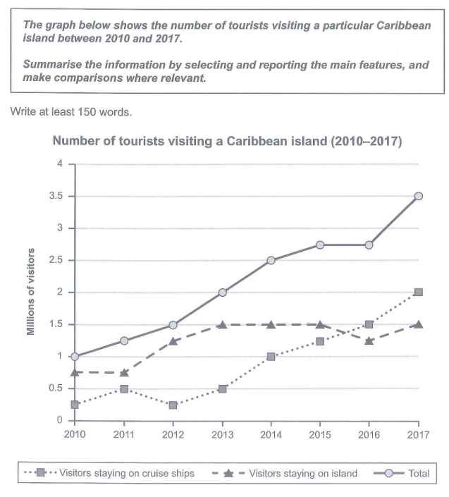
The graph below shows the number of tourists visiting a particular Caribbean island between 2010 and 2017.
Summarise the information by selecting and reporting the main features, and make comparisons where relevant.


The line graph illustrates how many tourists made a visit to an island in Caribbean from 2010 to 2017, measured by millions.

Overall, the total travellers who went to the Caribbean island saw an upward trend, which was the result of increases in the amounts of visitors who stayed on both cruise ships and the island. It is also noticeable that the figure for cruise ship tourists surpassed the island one from 2016 onwards.

Starting from 1 million tourists, the number of Caribbean island's visitors grew gradually to approximately 2.8 in 2015, before remaining unchanged in the next year. Then, the figure increased dramatically to 3.5 million travellers in 2017.

Traveller numbers staying on cruise ships first fluctuated in the range from 0.25 to 0.5 million between 2010 and 2013, and then saw a gradual rise to 2 million visitors in 2017, surpassing the number of tourists who stayed on island in 2016. Meanwhile, 0.75 million tourists decided to stay on the island in 2010 and 2011, with a subsequent growth to its peak of 1.5 in 2013. In 2015, the figure declined slightly to 1.25 million after two years of remaining stable, and then grew again to 1.5 in 2017.

  • t1.jpg


Holt  Educational Consultant - / 15464  
Jan 13, 2022   #2
Okay. The most effective summary overviews are always written within 3 sentences covering the topic, high trend, low trend information from the graph. The summary presentation of the information is acceptable enoigh. However, the trending information is too much. Rather than just being a summary of the measurement graph, the writer opted to present a comparative discussion already. Something not done in these areas of the presentation.

The writer was given one image to represent in the report. That means, the paragraph number should not exceed 3 covering the summary + trend, data analysis, and comparison presentations. This is the reason why I said that the trending overview was overkill. It went into areas of discussion meant to be in the other 2 paragraphs. There is a demarcation line for information in these presentation paragraphs. Every paragraph has a purpose.


Home / Writing Feedback / The line graph illustrates how many tourists made a visit to an island in Caribbean from 2010 - 2017
ⓘ Need Writing or Editing Help?
Fill out one of these forms for professional help:

Best Writing Service:
CustomPapers form ◳

Graduate Writing / Editing:
GraduateWriter form ◳

Excellence in Editing:
Rose Editing ◳

AI-Paper Rewriting:
Robot Rewrite ◳