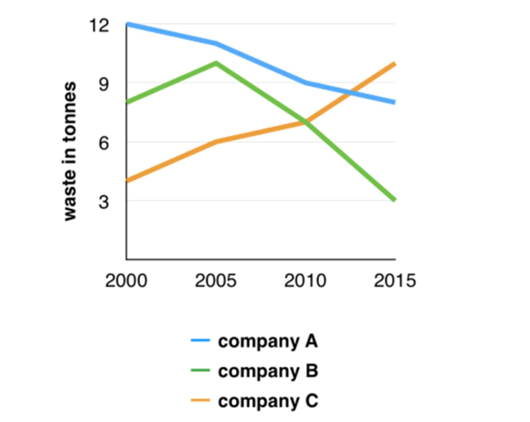
The given line graph depicts how much waste was produced by three different companies from 2000 to 2015.
Overall, it is clear that there was an upward trend in the amount of waste produced by company A and B, with the exception of company C decreasing.
According to the initial 5 year, company A started at the highest position, at 12 tons, then gradually dropped to about 11 tons, while company C which was the lowest company releasing waste had witnessed a sharp rise to over 6 tons in 2005. With the similar trend of company C, company B ranking the second also ascended rapidly to approximately 11 tons over a period of 5 year.
Regarding a decade later, although the amount of waste increased dramatically the previous period, company B underwent the same upward trend as company A which getting 3 tons and company A got 9 tons in 2015. In contrast, company C witnessed a significant soar of about 11 tons in the end of the period.

Thegraphbelowshow.png
