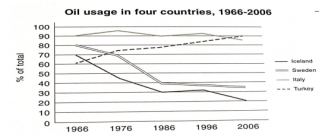
the usage of oil in four different countries
The graph below shows the usage of oil in four different countries between 1966 and 2006 as a percentage of total energy use within each nation.
Summarize the information by selecting and reporting the main features, and make comparisons where relevant
Answer
The given line graph provides the information about the percentage of using oil in Iceland, Sweden, Italy and Turkey from 1966 to 2006.
At the first glance, it is clear that there are several changes from 1966 to 2006. In 1966, the figure of Iceland was the highest and the figure Turkey was the lowest in four countries. In that time, proportions fluctuated over the forty-year period and in 2006, the number of Iceland was the second and the number of Turkey was the tallest.
According to the chart, between 1996 and 1986, the number of using oil Italy went down significantly from 70% to 30% and it was the lowest. From 1966 to 1986, the figure of using energy Sweden decreased quickly about 80% to 40%. Moreover, the average amount of using oil Sweden in 1986 was two times as high as it in 1966. While in Turkey, percentages rose rapidly 80%, the percentage of using oil in Iceland remained. Although, there was nearly no change in the using oil in Iceland, it was still the highest. In addition, the number of using oil in Turkey was the second.
As can be seen that, from 1986 to 2006, in Sweden, Iceland and Italy, there was a significant decrease in the amount of using oil at 35%, 85% and 20%. Furthermore, the number in Italy was the lowest. Whereas number of using oil in the other countries downward, the figure in Turkey increased and peaked at 90% that it was the highest.

Untitled_123.png
