Unanswered [0]
  

Home / Writing Feedback   % width   Posts: 3


[Ielts task 1] 2 line graphs about expense on children's sport and the number of participants


Mai Tran 1201 1 / 1  
Jul 13, 2018   #1
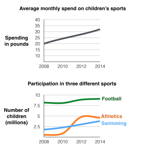
The first chart below gives information about the money spent by British parents on their children's sports between 2008 and 2014. The second chart shows the number of children who participated in three sports in Britain over the same time period.

The first chart illustrates the expense on British children's sport from 2008 to 2014. The second graph compares the number of children taking part in football, athletics and swimming in Britain during the same timescale.

Overall, the money spent on children's sports experienced an increase between 2008 and 2014. It is also clear that football remained to be the most popular sport among Britain children during the same time.

In 2008, British parents spent 20 pounds per month on their children's sport. Since then, this amount of money increased by 5 pounds every two years, with 25 pounds in 2010 and 30 pounds in 2012. This figure then peaked at 32 pounds at the final year of the period

As can be seen from the second graph, the highest number of junior participants in sports was recorded in football. It stood approximately at 8.5 million in 2008 and rose to 9 in 2014. While swimming was second to football in terms of attendances in 2008 with 2.3 million participants, its figure was then overtaken by that of athletics in 2011. During a six-year period starting from 2008, athletics surged and reached 4.9 million in 2014.

I'm preparing for an IELTS test and this is my writing. I hope the contributor can give me some feedback and advice on improvement, and a suggested band score if possible

  • t1.png


Red Moon 14 / 32  
Jul 15, 2018   #2
Hi, I'm not a native speaker but I'm glad to help you with your essay.
Overall, your essay is well-structured and easy to understand. There are just a few mistakes such as:
the expense of
I think "of" is more correct.
British children's sports
You sometimes forget the "s".
This figure then peaked at 32 pounds...
I wouldn't use "peak" for the figure at the end of the period.
During a six-year period...
From 2008 to 2014, there are 7 years: 2008,2009,2010,2011,2012,2013,2014.
Holt  Educational Consultant - / 15469  
Jul 15, 2018   #3
Tran, you did a very good job of developing this analytical report. If there is one observation about your summary overview though, it is that it could have used the addition of the instructional sentence. Something that tells the reader, who does not have access to the charts, what information you will be presenting and how. An example of this presentation (for information accuracy purposes) is:

Using the 2 graphs, a comparison analysis will be presented to the reader. Major data will be enumerated and comparison points will be presented in relation to the analysis requirements.

While presenting your trending statement as a stand alone paragraph is commonplace among exam takers and often advised by other tutors, I find that my students always score highest in terms of TA considerations when they present a completely developed 5 sentence summary statement that closes with the trending statement because the trending statement offers an additional overview / thesis statement to present the perceived outline of the discussion with.

Look at the current format of your trending statement and you will see that as a 2 sentence set-up, it appears to have some missing information. However, when combined with the information from the first 2 sentences above it, you create a more cohesive and coherent summary presentation. That is guaranteed to increase both your TA. GRA, and C&C scores. Although you will not lose points for having less sentences per paragraph, you will have a higher score for writing more sentences starting from the suggested 3 sentence minimum up to the maximum allowable of 5 sentences based on each criteria.

I reviewed the way that you presented "uncertain" information from the graph that requires you "estimate" the amount of average monthly spend on the children's sports and came to realize that you did not use the proper "guess" word for the "in- between" figures. When an amount falls in between 2 figures in the graph, it is always best to use the term "the estimated cost" or a variation thereof in order to indicate that the line figure does not fall into a solid number bracket in the presentation. Accuracy is the name of the game in this essay so when the presentation does not give you that, it is best to "estimate" in order to avoid confusion.

By the way, when you analyzed the sports participation, you mentioned everything except how athletics and swimming overlapped somewhere in between 2010 and 2012. That small reference to a measurement others may miss in the presentation could help to increase your TA score as well. Make sure you know how to properly reference the citizens of a particular country. The reference is "British children", not "Britain children").

Also, the report must be in plural form since there is more than a singular figure presented. In the 3rd paragraph, the proper reference is "children's sports". Once a plural form is used, in this case children, the succeeding descriptive words should also be in plural form so "sports". Most specially since there is a reference to several sports in the given line graph.

Finally, about your chart descriptions. Don't say "in the first chart", you have to identify the type of chart for each informational reference. So, in this case, you should have said "In the first line chart..."


Home / Writing Feedback / [Ielts task 1] 2 line graphs about expense on children's sport and the number of participants
ⓘ Need Writing or Editing Help?
Fill out one of these forms for professional help:

Best Writing Service:
CustomPapers form ◳

Graduate Writing / Editing:
GraduateWriter form ◳

Excellence in Editing:
Rose Editing ◳

AI-Paper Rewriting:
Robot Rewrite ◳