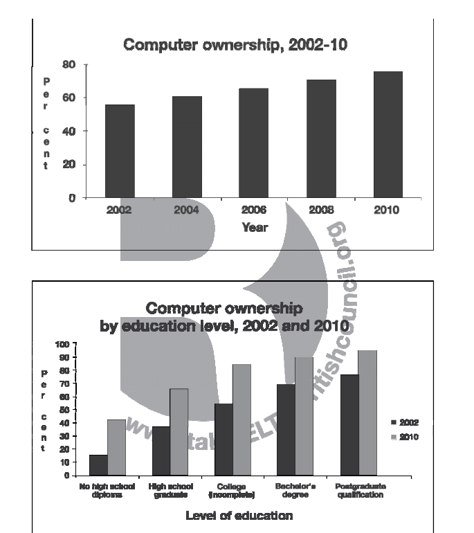
The first bar chart illustrates the percentage of computer ownership and the second bar chat categorize by degree of education from 2002 to 2010.
The first chart shows that the percentage tends to slightly increase every year.
In 2002, people has had personal computer around 55% but it moved up to almost 80% in 2010. The second chart, divided by education, the comparison data between 2002 and 2010 represents that people who held higher degree have computer more than people who held lower qualification. However, the percentage of growth of ownership in lower degree's people increases faster than higher one. Besides, postgraduate qualification owner is the highest group of people that have personal computer to use more than other groups in 2002 and 2010.
In conclusion, the bar charts show that the number of people has personal computer increase between 2002 and 2010. Also, the percentage of ownership increase when people have higher qualification however rate of ownership rapidly growth in lower degree people.
164 word

ffff.PNG
