You should spend about 20 minutes on this task. Write a report for a university lecturer describing the information in the graph below. You should write at least 150 words.
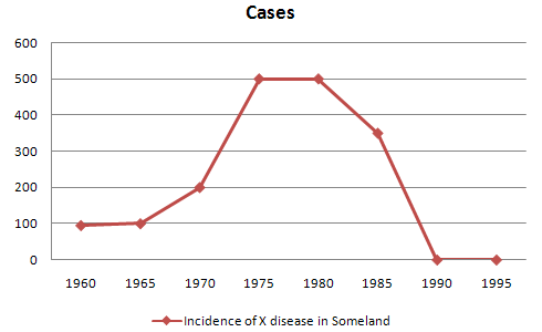
The graph shows the number of cases of heart diseases in England during four decades(1960 to 1990). It can be clearly seen from the graph that the figure of heart patients was highest in 1970 and 1980.
According to the graph, the cases of heart diseases were only 100 in 1960 and 1965, however, they started growing gradually up to 200 in next five years(1970). But this trend went sharply up in 1975 and the figure of heart patients raised to 500 in just 5 years. However, this number stayed at the same level in 1980.
The incidents of heart diseases started to decline steadily to 300 in 1985 and dropped even lower to 0 in 1990. This figure remains 0 in next five years(1995).
To sum up, the figure of heart diseases in England changes dramatically from 100 to 500, stays there for a while and then suddenly goes back to 0.

G59.gif
