Hi guys, comment me please
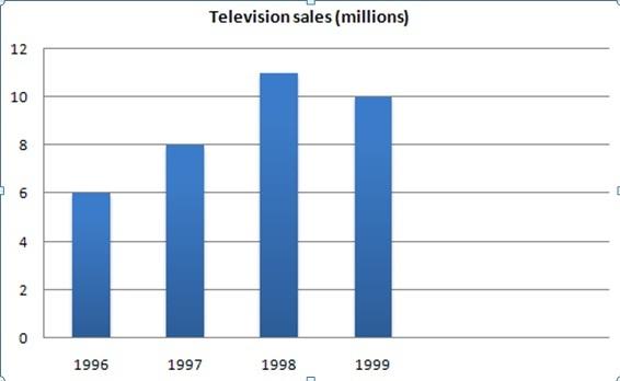
The bar graph describes the fluctuation the number of television sales among in 1996 and 1999. It gives us the announcement of the development of the sales each year.
In 1996, selling television was only 6 million units and it rose to 8 million units in 1997. There was an increase significantly in 1997 to 1998 started from 8 million going to 11 million units. However, reducing had happened in 1998 to 1999 by the difference of valuable sales was 1 million televisions.
Overall, we can see this bar chart which the lowest sale occurred in 1996 by 6 million units and sales in 1999 were the highest sales with sales of 11 million units. An increase in sales occurred generally from year to year except in 1999, television sales dropped slightly.
The given bar graph illustrates television sales which happened from 1996 to 1999 based on the number of sales annually.

chart.jpg
