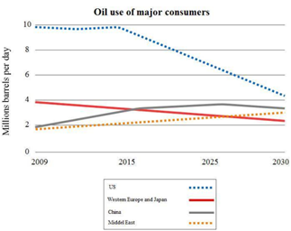
The graph below gives information about total oil use of 4 main consumers from 2009 to 2030
My writing:
The line graph illustrates oil consumption of four different major consumers in the 2009-2030 period.
It is noticeable that oil consumption of the US and Western Europe and Japan are expected to decline while the figure for China and the Middle East are predicted to increase from 2009 to 2030. The US will be the region that consumes the most oil of the period shown.
In 2009, the US accounted for the biggest amount of oil consumed per day, about 10 million barrels, which is bigger than a combination of all oil consumption of all other areas. Western Europe and Japan used approximately 4 million barrels per day, while two rest regions consumed the same minimum amount of oil, 2 million barrels per day.
From 2009 to 2015, the oil consumption of the US was remained at about 10 million barrels per day, before experienced a falling trend and will be predicted to drop to approximately 4 million barrels in 2030. Although the oil consumption of China was always higher than the figure for the Middle East, both regions shared the same tendency of raising. The figure for both areas is expected to increase to about 3 million barrels per day by the year 2030. By contrast, the amount of oil consumption of China gradually decreased and will be forecast to fall to over 2 million barrels per day at the end of the period shown.
Pls take a look and give me any comment. Thank you so much.

Untitled.png
