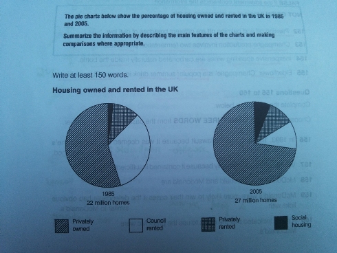
The pie charts below show the percentage of housing owned and rented in the UK in 1985 and 2005. Summarize the information by describing the main features of the charts and making comparisions where appropiate.
The first chart shows the proportion of housing owned and rented in 1985 while the second chart gives information about the percentage of private and rent accommodation in 2005.
In general, most of people prefer to stay at the privately owned housing than live in social housing. Perhaps social housing has limited facilities which make people uncomfortable meanwhile private house is the appropriate place for inhabitants.
As seen, in the 1985, more than 50 percent was occupied by private housing and came to second council rented over than quarter. Moreover, the third and fourth places were privately rented and social housing which had the lower percentage. Interestingly, the number of people who chosen privately owned was the notable incline showed, while the percentage of council rented indicated the significant decline.
A more detailed look at the second graph informs that privately owned had had suitable accommodation which was the highest proportion (three-quarter) than others types housing. Followed by council rented and privately rented which stood in the second and third favorite housing had almost quarter of whole percentage. By doing so, social housing gained the lowest percentage in the 2005.
In conclusion, there was a dramatic grow from 22 to 27 million homes during 20 years, between 1985 and 2005.

20140208_074339.jpg
