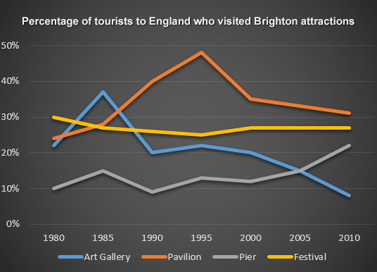
The line graph shows the percentage of tourists to England who visited four different attractions in Brighton.
My answer
The line graph illustrates the proportion of visitors to England who went to four different tourist attractions in Brighton between 1980 and 2010.
Overall, it is clear that the percentage of visiting Pavilion and Pier increased over the period of 30 years while the figure for other attractions in Brighton fell.
In 1980, Festival was the most popular attractions for visitors to England. Although having the highest percentage at 30% in 1980, this figure had fallen slightly to 28% by the year 2010. The percentage of visitors who went to Art Gallery stood at 22% in 1980. After 5 years, it reached the peak of 37%. However, this figure then declined to 20% in 1990. Throughout the remainder of the period, the figure continued to drop sharply to under 10% in 2010.
As it can be seen from the graph, the proportion of tourists visiting Pavilion in Brighton had the starting figure at approximately 25% in 1980. In 1995, this figure reached its highest point at 50% before plunging to 30% in 2010. Despite fluctuations, the proportion of visitors traveling Pier rose from 10% in 1980 to over 20% in 2010.
Thank you for reading

IELTS_Writing_Task_1.png
