Unanswered [1] | Urgent [0]
  

Home / Writing Feedback   % width   Posts: 2


IELTS TASK 1 : the percentage of women in poverty and poverty rates by sexs and ages.


Reni Ratna Sari 1 / -  
Oct 19, 2018   #1

the poverty proportion of females and males


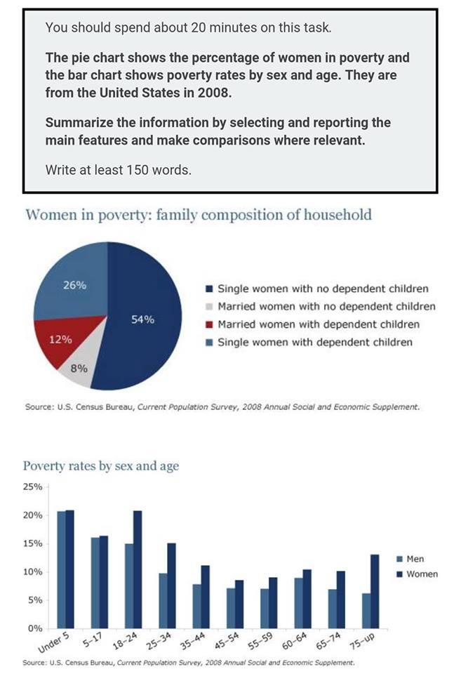
The two given charts illustrate the different percentages of women becoming poor and poverty ratio according to gender and age ranges in the United States in 2008. Overall, majority single females without kids became the poorest, while there was a small ratio of poor married females without children. Moreover, females experienced poverty than males according to gender and age.

In the pie chart, more than a half of single women without children were reported as the poorest people. This contrasted to married females without kids showing the lowest percentage at 8%. However, both single and married women having kids took the second and the third of disadvantaged people with 12% and virtually a quarter respectively.

In the bar chart, the poverty proportion of females and males were quite similar at around a fifth in under 5 years old, although the poor elders decreased at approximately 13% of females and 7% of males in the above their 75s. Finally, poverty ratio of women when they were in 45-54 age group reached the last rank at a tenth and men with the same age range were accounted around 7% as well as those in 55-59 age group.

  • IMG20180801WA0013..jpg


Holt  Educational Consultant - / 15385  
Oct 19, 2018   #2
Reni, first up, you must make sure to identify the type of charts that are provided in the summary overview otherwise you will be considered to have an incomplete summary. You should have indicates the illustrations on an individual basis ;

"A pie chart covering the family dynamic of poor women, along with a column chart of the genders considered poor were provided for analysis. The source of the information is the U.S Census Bureau, Current Population Survey, 2008 Annual Social and Economic Supplement. The trend for the pie chart indicates... while the column chart shows..."

In the above sample, I indicated the missing information from your summary overview in order to show you how it could have been presented in a stronger manner. Next time, try to break up your sentences in terms of information so that you will not be scored down for having run on sentences. Try to present at least 3-5 sentences per paragraph and do your best to use the 4 paragraph format in order to increase your scoring possibilities. When you write in individual sentences, you will find that it will become easier to create the 4 paragraph format. Also, use the actual digits from the graphs rather than measured possibilities. The information given is specific for a reason. These are actual analysis graphs. Any assumed measurements are acceptable only in illustrations that do not have clearly defined measurements in the presentation.

Overall, this isn't a bad attempt. It is informative, though it could inform the reader on a better scale if the mistakes I mentioned were not present. However, the essay does well in informing the reader to a certain degree so you should get a decent score for this type of presentation in an actual test.


Home / Writing Feedback / IELTS TASK 1 : the percentage of women in poverty and poverty rates by sexs and ages.
Need Writing or Editing Help?
Fill out one of these forms:

Graduate Writing / Editing:
GraduateWriter form ◳

Best Essay Service:
CustomPapers form ◳

Excellence in Editing:
Rose Editing ◳

AI-Paper Rewriting:
Robot Rewrite ◳

Academic AI Writer:
Custom AI Writer ◳