Coffee & Tea drinking habits in five Australian cities
The chart below shows the results of a survey about people's coffee and tea buying and drinking habits in five Australian cities.
Summarise the information by selecting and reporting the main features, and make comparisons where relevant.
(I attached the image containing the chart)
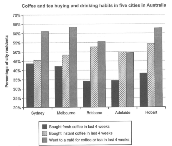
The bar chart depicts the percentages of residents for various ways of drinking coffee and tea in five Australian cities in 4 weeks.
Overall, citizens preferred drinking at a café the most for all cities except for Adelaide. In addition, fresh coffee was consumed the least, and Hobart recorded the greatest difference between the percentage for buying fresh coffee and the percentage for visiting cafés.
Regarding Sydney, the figures for fresh coffee and instant coffee were around 45%, whereas that for on-site drinking was above 60%. As for Melbourne, the proportions of residents who bought fresh coffee and bought instant coffee were approximately 42% and 48%, respectively. Residents of the city who went to a cafe was roughly 63%, highest of all cities.
On the other hand, the percentage of people who bought fresh coffee in Brisbane was roughly 35%, which is significantly less than the figure for instant coffee drinkers and cafes visitors of the city. About 38% of Hobert citizens purchased fresh coffee in 4 weeks, while the figures for instant coffee and on-site drinking were around 55% and 63%. Meanwhile, Adelaide had 35% of its residents buying coffee in this period, less than half of the percentages for instant coffee, which is similar to the figure for cafes visitors.

chart
