Unanswered [2] | Urgent [0]
  

Home / Writing Feedback   % width   Posts: 4


IELTS PIE CHART: The charts illustrate the annual income and expense of a US charity organization.


anthonyphan 2 / 4  
May 3, 2020   #1

Revenue sources and expenditures of a USA charity


The charts illustrate the annual income and expense of a US charity organization in 2016.
Overall, the entity spent less money than they accumulated. The primary source of revenue was donated food and program service, and the majority of expenditures came from program service.

In regard to the revenue sources, donated food and community contributions accounted for exactly 97% of the money this entity accumulated ( donated food comprised of 86.6% and community contributions represented 10.4%). The remaining sources of revenue was program revenue (2.2%), investment income (0.2%), government grant (0.2%) and other income (0.4%). And the total revenue for the year was 53,561,580$.

In terms of expenditures, program service took the most significant part of total expenses the entity spent in 2016, which comprised of 95.8%. Beside that, the organization paid for fundraising activities (2.6%) and management and general (1.6%). And the total expenditure for the year was 53,224,896$
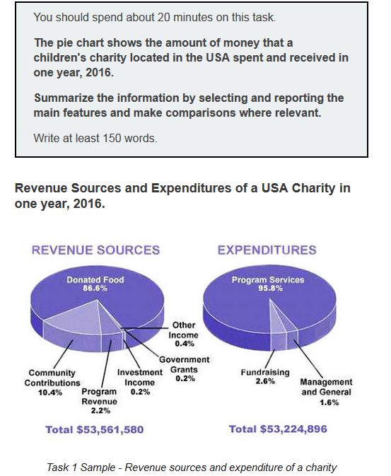

  • Piecharts2.JPG


Ladybugssss 1 / 1  
May 3, 2020   #2
In my opinion, the major problem here is a lack of comparison between statistics, right now it looks like a description of the graphic.
Kirote 1 / 3  
May 3, 2020   #3
The US currency symbol should be on the left of the dollar amount.
Also, in my opinion, you are overusing the brackets.
Holt  Educational Consultant - / 15386  
May 4, 2020   #4
You need to learn to properly format the Task 1 reporting presentation. Based on the information presentation requirements, you need to have presented the following:

- Summarize the main information
- Select and report the main features
- Make comparisons where relevant

When you summarize the main features, you need to use a 3-5 sentence format for the paragraph. You need to make sure that you present more than just the topic and image type. By the way, you should have identified this as a pie chart. There are several types of charts so you need to be specific about it for information accuracy in your presentation. What was missing from your presentation are:

- The method by which each chart was divided between the two pie charts
- Method of measurement
- A singular trending statement

The worst thing you can do in a chart report is to rely on the use of parenthesis throughout your presentation. Using a parenthesis throughout means you are unable to fulfill 2 of the reporting requirements:

- You failed to properly report the main features
- You failed to make comparisons in the discussion

The essay format is actually a 4 part paragraph presentation even though there are 3 instructions to be fulfilled:

Par. 1: Overview and trending statement
Par. 2: Revenue sources
Par. 3: Expenditures
Par. 4: Comparisons

The comparison discussion should have been represented by a report presenting the following information:

- Investment income
- Fundraising
- Management and general

The aforementioned reporting approaches / formats would have helped you present a clear, comparative, and informative pie chart report.


Home / Writing Feedback / IELTS PIE CHART: The charts illustrate the annual income and expense of a US charity organization.
Need Writing or Editing Help?
Fill out one of these forms:

Graduate Writing / Editing:
GraduateWriter form ◳

Best Essay Service:
CustomPapers form ◳

Excellence in Editing:
Rose Editing ◳

AI-Paper Rewriting:
Robot Rewrite ◳

Academic AI Writer:
Custom AI Writer ◳