Unanswered [1] | Urgent [0]
  

Home / Writing Feedback   % width   Posts: 6


(IELTS Task 1) a pie chart describing water purposes - for analysis


tommychan 1 / -  
Sep 1, 2017   #1
If you can score my essay, I will very appreciate you. Also, is it suitable for this classification in this essay?

-------------------------------------------------------------
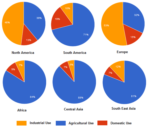
The charts below show the percentage of water used for different purpose in six areas of the world.
Summarize the information by selecting and reporting the main features, and make comparisons where relevant.

--------------------------------------------------------------

how is the water utilized?


The figure presented for analysis is a pie chart. It illustrates the percentage of water used for different purposes in six places. To better capture their distinctions, six areas will be split into two groups - developing countries and developed countries. North America and Europe are developed countries; South America, Africa, Central Asia and South East Asia are developing countries.

Overall, the percentage of agricultural water use in four developing countries more than developed countries. Also, the percentage of industrial water used in developed countries more than developing countries. Domestic water use is the least proportion in three water use for different purposes in six areas.

In developed countries, approximately half of industrial water use in North America and Europe. Also, about 15% domestic water use in two countries. On the other hand, nearly 40% agricultural water use in North America; less than a third of agricultural water use in Europe.

In developing countries, approximately 80% of agricultural water use in four developing countries. In industrial water used aspect, nearly 12% water used in South America and South East Asia; about 7% in Africa and Central Asia. In domestic water used aspect, about 9% water used in Africa, Central and South Asia. However, approximately 20% of domestic water use in South America.

  • 305053_1_o.png


Holt  Educational Consultant - / 15385  
Sep 1, 2017   #2
Tommy, you must only use information given in the illustration. Since there was no differentiation between developing and developed countries specifically mentioned in the illustration, you should not have mentioned that at all. That is considered misinformation and would have led the reader astray, meaning, you would have supplied wrong information to the reader that may have an effect on the opinion that he is supposed to create based on your summary report. A simple listing of the 6 countries involved would have been sufficient enough to strengthen the opening statement. Instead, you weakened the overall essay by including fictitious information. By the way, in the summary overview, you forgot to mention what the uses of water that were being reviewed were. That is required information that you forgot to include. Remember, use all the information in the chart. Do not make up information as that will make you fail the test.

You lack trending information in the essay and your last 2 paragraphs fall short of the required 3-5 sentence requirement. This means that you did not bother to try and develop a well written essay. You just wanted to be over and done with it. The short paragraphs / sentences indicate a lack of analysis of the information given. You were not careful in the development of your essay content. You took liberties by presenting information that was not included in the illustration and basically, threw away your chance at getting a passing score at the very least. In my opinion, this particular presentation will not score higher than a 5 due to the problem with your presenting inaccurate information and other problems previously mentioned.
tran14 12 / 26  
Sep 4, 2017   #3
1) Check your usage of prepositions.
2) In the introduction and overview, you just have to do 2 things: Paraphrasing the topic sentence and giving the main trend of the most significant details in brief. Do not make it too complicated because reader may get lost and be confused reading your work. This will heavily influence your score. Furthermore, it is a must that you paraphrase the words used in the topic; otherwise, they won't give you mark for the introduction.

3) Your way of expressing is cumbersome. Some sentences do not make sense.
4) You do not need to classify charts into groups in your overview.
5) Grammatical mistakes.
6) Do not list the information. You have to make comparisons, which is asked in the prompt. In addition, do not use short and single sentences to introduce each detail. This is the cause of incoherence in your paragraph, since each sentence just mention one data. You do not link them together at all. Try to make them connected next time.

7) In developed countries, approximately half of industrial water use in North America and Europe. => you misunderstand here. It should have been 'approximately half of the water volume is used in industry...'.

8) Your information is misleading. Fix this first because it is really important to point out accurate data in task 1.
9) It seems to me that you just picked up information you considered noticeable. It is not good to write down too many details like this. An acceptable essay must contains a moderate amount of important information and comparisons between those written.

In general, it is my suggestion that you ought to practice analysing the illustration first. After that, you can start practicing.
Eve0309 3 / 5  
Sep 4, 2017   #4
Use only the information that chart give to you, do not create by yourself. Also, you have to comapre the relevant and not just write the number.

I also can not find the point in your essay because it seems like you continue to repeat the same thing. It will be very helpful if you check some sample before you write.

ps: I also try to pass the test, let's do together!
evamusifa 1 / 2  
Sep 5, 2017   #5
Tommy, for me, you lack putting comparison in both data (you may compare between developed and developing country directly)
for example : approximately half of industrial water use in North America and Europe as the developed countries. The reverse is seen in the developing country particularly in Africa people using merely on in ten of total.

How you paraphrase the question also does not organize well (perhaps, you no need list the countries because "developed and developing countries" are enough to illustrate the data

for the last paragraph also lack of synthesizing and comparison, you tend to list the percentage from the the data
LaLaLand999 3 / 6  
Sep 7, 2017   #6
Hi :) There are actually many problems with this report. First of all, you haven't made any comparisons; you have just given data. Also, the first sentence of your introduction wasn't necessary, you could have just said: "the chart illustrates". Besides that, don't add more information than that the chart provides you with.


Home / Writing Feedback / (IELTS Task 1) a pie chart describing water purposes - for analysis
Do You Need
Academic Writing
or Editing Help?
Fill out one of these forms:

Graduate Writing / Editing:
GraduateWriter form ◳

Best Essay Service:
CustomPapers form ◳

Excellence in Editing:
Rose Editing ◳

AI-Paper Rewriting:
Robot Rewrite ◳

Academic AI Writer:
Custom AI Writer ◳