Unanswered [0] | Urgent [0]
  

Home / Writing Feedback   % width   Posts: 3


The Pie Chart - the proportion of water usage by various categories in Sydney, Australia (1997-2007)


duongtranah02 1 / -  
Aug 19, 2020   #1

IELTS Writing task 1: Pie Chart


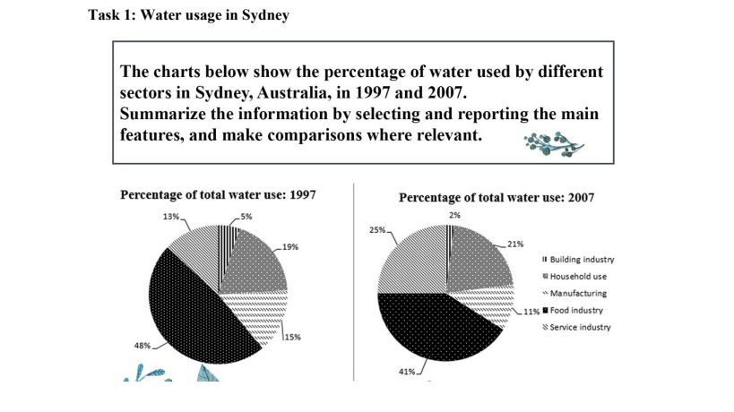
The chart compare the proportion of water usage by various categories in Sydney, Australia in 1997 and 2007
Overall, food industry accounted for the highest percentage of water use in sectors. Additionally, in terms of service industry, the proportion of total water use almost doubled.

In 1997, the figure for water consumption in food industry was exactly 48%. The amount of water used for manufacturing and building industry was much lower, at 15% and 5% respectively. There was a decline of water consumption in 3 sectors, the figure for food industry dropped slightly to 41%, compared to 11% and 2% of manufacturing and building industry respectively.

On the other hand, the period from 1997 to 2007 saw a increase in water usage in the other sectors ( service industry and households). While the percentage of water use in households rose significantly from 13% to 25%, there was a minimal climb in the amount of water consumed from 19% to 21%.

  • fr.png


Holt  Educational Consultant - / 15347  
Aug 19, 2020   #2
There was an immediate error in your first sentence. Review your singular v plural presentation rules. There are 2 images in the presentation. You said there was only 1 but, that single image offers a comparison. That is incorrect. For one thing, what you were presented with wasn't a chart. This is a pie chart. In fact, there are 2 pie charts presented for comparison purposes. That is what your first sentence should have actually said. A reference to the industries / sectors and the measurement type would have helped add to the important information that was presented in the comparison images.

By the way, only a graph or bar chart can have presentations that compare its data within one image. A pie chart usually uses 2 image presentations for the information presentation and comparison aspect. Keep that difference in mind for the next time you write the description of the measurement image.

Rather than saying, "On the other hand", since you never said "On the one hand", you could instead use a topic sentence to start the presentation. In the previous paragraph you said "In 1997" so the next paragraph could say "1998 all the way up to 2007..." You cannot start with 1997 again because you already used that time reference in the preceding paragraph.
aqsa27 1 / 2  
Aug 19, 2020   #3
you need to improve your reporting skills, you have made mistakes such as chart instead of using charts or jus pointing out which one you referring to.


Home / Writing Feedback / The Pie Chart - the proportion of water usage by various categories in Sydney, Australia (1997-2007)
Do You Need
Academic Writing
or Editing Help?
Need professional help with your assignments? Fill out one of these forms:

Graduate Writing / Editing:
GraduateWriter form ◳

Best Essay Service:
CustomPapers form ◳

Excellence in Editing:
Rose Editing ◳

AI-Paper Rewriting:
Robot Rewrite ◳