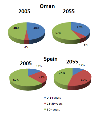
The pie charts illustrate the proportion of age groups in Oman and Spain between 2005 and 2055. Overall, people at the age of over 60 account for the highest percentage in both nations from 2005 to 2055.
In particular, in 2005, it is apparent from the charts the percentage of people under 14 made up in both countries: 48 percent and 14 percent respectively. However, it is anticipated that by 2055, the rate will fall slightly at 37 percent in Oman and 12 percent in Spain. Likewise, there was a higher proportion of over 60 year old Spain people compared to Oman ones at 62 percent in 2005. On the contrary, the prediction is that this age in Spain will dramatically decrease at 46 percent by 2055.
By contrast, the percentage of Oman population at the age of over 60 will considerably climb in 2055 at 57 percent in comparison with 48 percent by 2005. Similarly, in 2005, 4 percent and 24 percent of both nations were between 15 and 59. In contrast, by 2055, it is expected that the ages will rise approximately by half: 6 percent and 42 percent respectively.

IELTS_Writing_Task_1.png
