Unanswered [1]
  

Home / Writing Feedback   % width   Posts: 6


IELTS: The pie charts indicate different percentages of expenditure on seven items


digitalidea 10 / 11  
Jul 25, 2014   #1
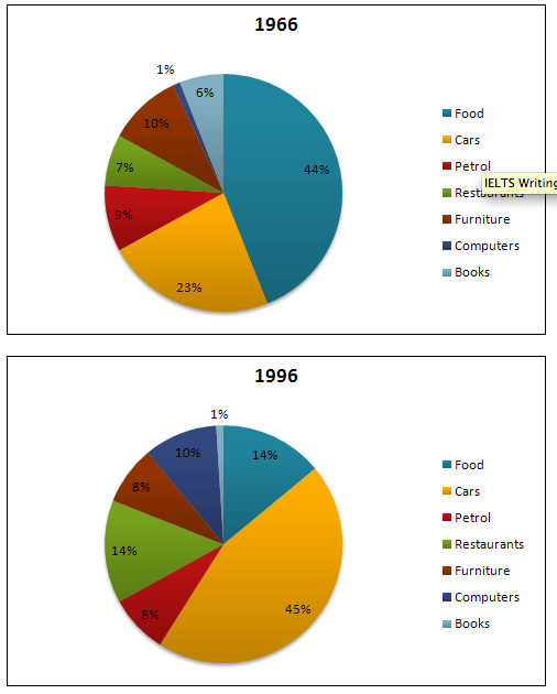
The pie charts indicate different percentages of expenditure on seven items in US from 1966 to 1996.

It is obvious that food and cars constituted the largest part of all spending in both years. The highest percentage of expense was in food, at 44% in 1966, but it sharply dropped to 14% in 1996. In contrast, the proportion of expense on cars nearly doubled, rising from 23% to 45% within 30 years.

The proportion of expenditure on computer had a significant rise at the fastest pace, increasing from 1% to 10%. However, the figure about books saw a dramatically downward trend, declining to only 1% in 1996. The figure of restaurant doubled to 14% during 30 years, while petrol and furniture had similar percentages of expense in both years, slightly falling to 8% in 1996.

Overall, more than half of expenditure was still spent on food and cars, although the proportions of other items experienced various changes.

  • _20140723_10.png


manutd9111993 3 / 6  
Jul 28, 2014   #2
The pie charts indicate different percentages of expenditure on seven items in US from 1966 to 1996in 1966 and 1996 .

It is obvious that food and cars constituted the largest part of all spendingexpenditure in both years. The highest percentage of expense was in food, at 44% in 1966, but it sharply dropped to 14% in 1996. In contrast, the proportion of expense on cars nearly doubled, rising from 23% to 45% within 30 years.

The proportion of expenditure on computer had a significant rise at the fastest pace, increasing from 1% to 10% (it's not the fastest) . However, the figure about books saw a dramatically downward trend, declining to only 1% in 1996. The figure of restaurant doubled to 14% during 30 years, while petrol and furniture had similar percentages of expense in both years, slightly falling to 8% in 1996.
eddies [Contributor] 25 / 1170  
Aug 18, 2014   #3
It is obvious that food and cars constituted the largest part of all spending in both years.

Clearly, the public expenditure of food and cars in in both years showed the maximum percentages.

The proportion of expenditure on computer had a significant rise at the fastest pace, increasing from 1% to 10%.

Initially, the public expenditure of computer was fairly low, at only 1%. However, this figure increased dramatically over the 30 years to represent the third largest proportion of public expenditures in 1996 at 10%
Pyon9x 11 / 19  
Aug 19, 2014   #4
i think you sould paraphrase the intro

The pie charts indicate different percentages of expenditure on seven items in US from 1966 to 1996.

it is not good to copy exactly the topic

btw, i think you can replace the word "expense" which is repeated many times by "the amount of money spent on", the spending, expenditure, etc
dumi 1 / 6793  
Aug 22, 2014   #5
The pie charts indicate different percentages of expenditure on seven items in US fromin 1966 toand 1996.
You have made a fundamental error there... They give very different interpretations :(

It is obvious that food and cars constituted the largest part of all spending in both years. The highest percentage of expense was in food, at 44% in 1966, but it sharply dropped to 14% in 1996. In contrast, the proportion of expense on cars nearly doubled, rising from 23% to 45% within 30 years.

Before coming to this detail paragraph, you should have written an Overview about what these pie charts present. This is what I suggest;
Overall, it can be observed that expenditure on food had drastically come down over the years and it had been replaced by the expenditure on cars.

Once you do the Overview, then you should move into detail paras to discuss trends with more details and figures.
SHanafi 120 / 357  
Sep 21, 2014   #6
The pie charts indicate different percentages of expenditure on seven items in US from 1966 to 1996.

The pie charts show the changing of the seven US expenditures in 1996.

within 30 years.

I am afraid that such information given is not attached in your charts. IELTS task 1 requiress the examinee to make a report with factual data attaching in the prompt.


Home / Writing Feedback / IELTS: The pie charts indicate different percentages of expenditure on seven items
ⓘ Need Writing or Editing Help?
Fill out one of these forms for professional help:

Best Writing Service:
CustomPapers form ◳

Graduate Writing / Editing:
GraduateWriter form ◳

Excellence in Editing:
Rose Editing ◳

AI-Paper Rewriting:
Robot Rewrite ◳