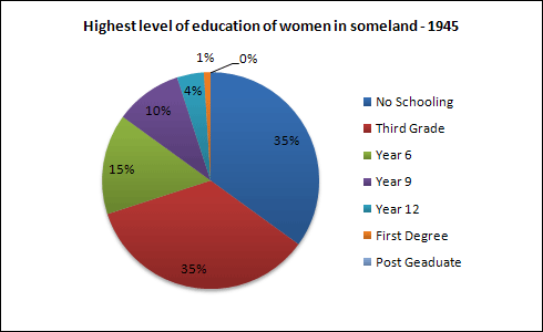
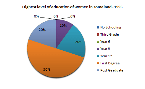
The pie charts below (at the end of the essay) show information on the highest level of education of women in Someland in 1945 and 1995.
The pie charts compare the percentages recorded as the results of a survey on female students' uppermost grade of education in Someland in 1945 and 1995.
As can be seen from the charts, in the latter year, the variety of levels reduced significantly. While some lower classes saw a slip, a few higher ones experienced an amazing surge.
From an overall perspective on the first pie chart, it is clear that no schooling and third grade sections accounted for the highest proportions which were slightly over a third at that time. On the other hand, post graduate occupied no portion at all, chich made it the lowest figure of all.
In the second illustration, first degree learners bore the most striking characteristic when making up exactly half of the chart. It is interesting to note that in 1945, the mentioned part just established no more than a hundredth; however, it rose rom which to a half within merely a decade. Following the same pattern, post graduate students increased to a fifth after the same period. Nevertheless, no schooling, third grade and year 6 experienced noticeable drops of 35%, 35% and 15% respectively, which caused them the lowest points and to disappeared from the chart.
female learners in Someland
The pie charts compare the percentages recorded as the results of a survey on female students' uppermost grade of education in Someland in 1945 and 1995.
As can be seen from the charts, in the latter year, the variety of levels reduced significantly. While some lower classes saw a slip, a few higher ones experienced an amazing surge.
From an overall perspective on the first pie chart, it is clear that no schooling and third grade sections accounted for the highest proportions which were slightly over a third at that time. On the other hand, post graduate occupied no portion at all, chich made it the lowest figure of all.
In the second illustration, first degree learners bore the most striking characteristic when making up exactly half of the chart. It is interesting to note that in 1945, the mentioned part just established no more than a hundredth; however, it rose rom which to a half within merely a decade. Following the same pattern, post graduate students increased to a fifth after the same period. Nevertheless, no schooling, third grade and year 6 experienced noticeable drops of 35%, 35% and 15% respectively, which caused them the lowest points and to disappeared from the chart.

ieltswritingtask1.jpg
ieltswritingtask1.jpg
