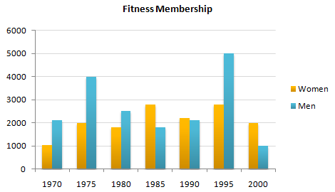
The chart prevents the comparison between male and female fitness member in a period of 30 years from 1970 to 2000.
Overall, male membership leads all proportion numbers, and it can be seen that a number of man often go to fitness more often than woman.
A more detailed reveals that man attending of fitness is the highest rate in 1995 at 5000 membership, and it followed in 1975 and 1970 which are twice larger than woman membership. In 1970, woman had slight improvement (1000) where man got 2000 membership, and woman rate in 1975 reached 2000 where the opponent got double member. However, in the last year, man could not come as the highest, but it vice versa which got only 1000 and the opponent leaded double.
In 1990 tends the most stable proportion between male and female member which reached almost same rate approximately 2000 membership
Based on the graph, I conclude that the possibility of healthy man is higher than woman.
P.S. This writing is made in 20 minutes.

Fitness_memebership..png
