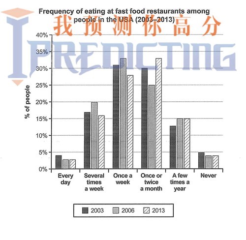
The chart below shows how frequently people in the U.S.A. ate in fast food restaurants between 2003 and 2013.
The bar chart illustrates the proportion of attendance in fast food chains in the U.S.A. within a 10 year period (2003 to 2013).
Overall, it is observed that people mainly preferred to eat at junk food restaurants either weekly or one to two times a month, whereas only a few paid a visit daily, or did not at all.
In detail, weekly fast food consumers corresponded to roughly 30% in 2003 and slightly increased to nearly a third three years later, before notably declining below 30% in 2013. Additionally, monthly visitors of fast food eateries reached exactly 30% in 2003 and, despite falling by 5% in 2006, they rose up to almost a third in 2013.
Moreover, those who went to such restaurants enough times per week were approximately a fifth in 2003, reaching 25% in 2006, but then decreased to just over 15% in 2013. Regarding people who attended fast food chains a couple of times a year, it is noticed that they accounted for almost 15% in 2003, before downfalling in 2006 and 2013.
Finally, daily and zero attendance were much less, namely just under 5% in 2003, whilst deducting below that in 2006 and 2013.
Words: 198
monthly visitors of fast food eateries
The bar chart illustrates the proportion of attendance in fast food chains in the U.S.A. within a 10 year period (2003 to 2013).
Overall, it is observed that people mainly preferred to eat at junk food restaurants either weekly or one to two times a month, whereas only a few paid a visit daily, or did not at all.
In detail, weekly fast food consumers corresponded to roughly 30% in 2003 and slightly increased to nearly a third three years later, before notably declining below 30% in 2013. Additionally, monthly visitors of fast food eateries reached exactly 30% in 2003 and, despite falling by 5% in 2006, they rose up to almost a third in 2013.
Moreover, those who went to such restaurants enough times per week were approximately a fifth in 2003, reaching 25% in 2006, but then decreased to just over 15% in 2013. Regarding people who attended fast food chains a couple of times a year, it is noticed that they accounted for almost 15% in 2003, before downfalling in 2006 and 2013.
Finally, daily and zero attendance were much less, namely just under 5% in 2003, whilst deducting below that in 2006 and 2013.
Words: 198

1.jpg
