Unanswered [1] | Urgent [0]
  

Home / Writing Feedback   % width   Posts: 3


The proportion of modern applications' domestic utilization in the UK from 1996 to 2003


tuongvy 1 / -  
Aug 13, 2018   #1

innovative technologies at the turn of the 20th and the 21st century


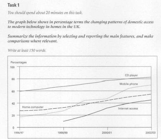
The graph elucidates the proportion of modern applications' domestic utilization in the UK from 1996 to 2003. It can be easily recognized that there was an upward trend among those four innovative technologies. However, CD players seem to be mostly used modern technology access in home.

According to the illustration, CD players had the biggest figure of all, which was 60% in 1996, followed by home computer and mobile phone with around 28% and 19% respectively. Not until 1999 did the Internet access appeared, this makes the Internet access had the lowest percentage of all four modern domestic applications. Nevertheless, it had the biggest fluctuation compared to the others.

Home computer, however, had quite a stable climb, from 28% to 58%. Mobile phone, on the other hand, fluctuated wildly but had an upward trend generally, this helped mobile phone become second in figure (70%), after CD players and accompanied by home computer and mobile phone, coming at third and fourth respectively. Due to mobile phone's late appearance, it seems to have the lowest percentages of all, but to have an overall view, it had the most noticeable change among four types of domestic access in modern technologies.

Note: I'm sorry if my writing contains so many faults :(( but I'm really bad at Writing, so I really need a comment that can point out my incorrection in this writing. I tried to write in 20 minutes so I'm not sure if I had understood the question clearly or not.

Thanks a lot. <3

  • Untitled.png


Minh2903 6 / 13  
Aug 14, 2018   #2
Hi Vy,

There are minor points I think you should pay attention to:
_ ... mostly used in modern technology access in the homes.
_You also should point out clearly the name of the graph, for example, the line graph demonstrates...

Overall, I think your essay is well-written and easy to follow.
Holt  Educational Consultant - / 15385  
Aug 14, 2018   #3
Tuong, there are several missing elements in your presentation that you need to address as a part of your next practice test. For starters, your summary overview is incomplete in terms of information presented and analysis. While you did present the purpose of the graph, you neglected to mention that the measurement used was percentages, the years being presented were on a year on year basis (1996/1997), and there is no indication of the outline for discussion such as the requirement for comparison points. Finally, you failed to identify what the 4 innovative technologies presented in the graph are. These are all part of the summarized or overview of information from the graph that comprise your summary overview.

While I can see that you are trying to increase your vocabulary score by using descriptive measurement words rather than the actual measurements indicated, it would be better for your overall score if you opt to use the data coming directly from the graph instead. That means, you do not say "second in figure (70%)" but rather simply saying it comes in second at 70%. Using a parenthesis means information is optional and thus, unimportant. Which is not the case for these analytical essays so avoid using alternative depictions and also parenthesis. You need to be accurate in the representation of this task because the assumption is that the reader does not have a copy of the graph, hence your report will be only basis of the information, which needs to be data accurate as much as possible.

The normal paragraph requirement for a well scored Task 1 essay is 4 paragraphs of up to 200 words. You only have 3 paragraphs so that means, while you did write more than the minimum amount of words, you are not properly separating the information presentation or you are lacking information presentation in your essay. In this case, you are missing the comparative paragraph at the end. Look at the graph. I am sure that you can see the intersecting points of information right? You have to report about those intersecting points as well because that is the required "comparison" point in the discussion. If it intersects, then there is a similarity in terms of sales or use for a given period and that should be included as additional data in the presentation.


Home / Writing Feedback / The proportion of modern applications' domestic utilization in the UK from 1996 to 2003
Need Writing or Editing Help?
Fill out one of these forms:

Graduate Writing / Editing:
GraduateWriter form ◳

Best Essay Service:
CustomPapers form ◳

Excellence in Editing:
Rose Editing ◳

AI-Paper Rewriting:
Robot Rewrite ◳

Academic AI Writer:
Custom AI Writer ◳