Please give this analysis some comments. Thank you so much!
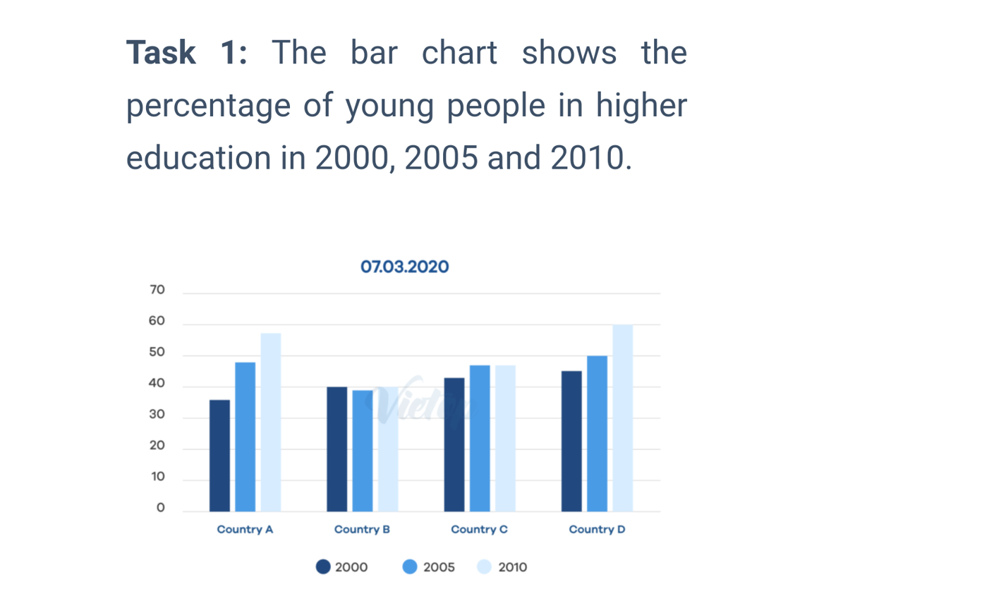
The bar chart given provides information on the pursuit for higher education of young people in four nations surveyed in three years, 2000, 2005, and 2010.
Over the timeframe, the proportion of the pursuers in Country A and Country D rose while the other nations experienced irregular changing patterns. In 2010, there were marked differences in the statistics, especially between Country D and Country B.
The percentage of youngsters pursuing higher education in Country A began at just over 35 % in the first year and increased dramatically in the next ten years. This was in resemblance to the tendency observed in Country D yet plotted less steep. Otherwise, the number for Country B varied marginally between 39 % and 40 % over the period.
Three fifths of the young people in Country D went to universities for their further study in 2010, accounting for the largest ratio in the year. This was followed by Country A whose the distribution was roughly 2 % lower. In contrast, Country B took the bottom position of the graph in the year, at only 40 %.
IELTS TASK 1 - FURTHER STUDY
The bar chart given provides information on the pursuit for higher education of young people in four nations surveyed in three years, 2000, 2005, and 2010.
Over the timeframe, the proportion of the pursuers in Country A and Country D rose while the other nations experienced irregular changing patterns. In 2010, there were marked differences in the statistics, especially between Country D and Country B.
The percentage of youngsters pursuing higher education in Country A began at just over 35 % in the first year and increased dramatically in the next ten years. This was in resemblance to the tendency observed in Country D yet plotted less steep. Otherwise, the number for Country B varied marginally between 39 % and 40 % over the period.
Three fifths of the young people in Country D went to universities for their further study in 2010, accounting for the largest ratio in the year. This was followed by Country A whose the distribution was roughly 2 % lower. In contrast, Country B took the bottom position of the graph in the year, at only 40 %.

Question
