the proportion of jobs in manufacturing, sales and services field
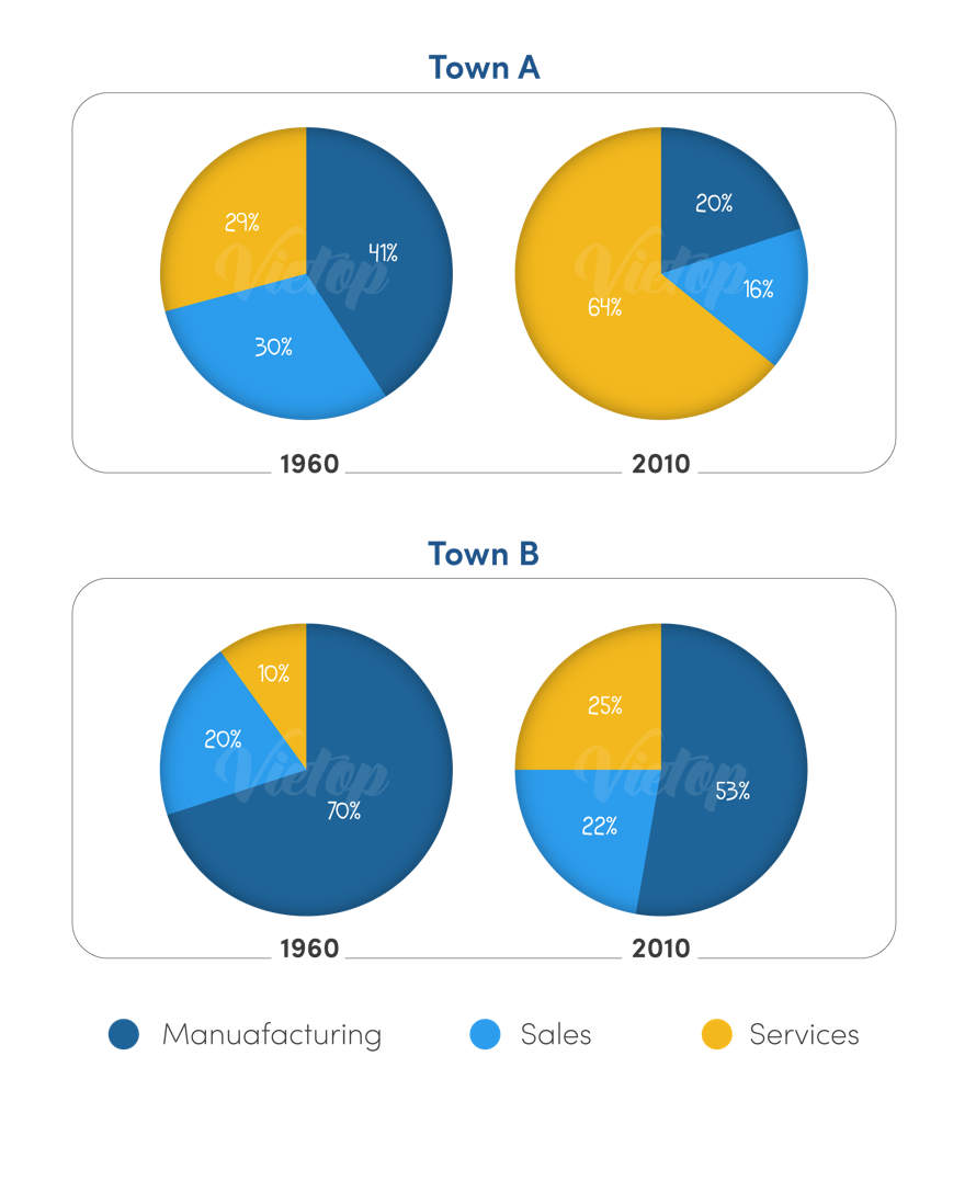
The provided four pie charts gives information on the rates of job distribution in three different sectors in Town A and Town B in two years, 1960 and 2010.
It can be seen that the percentage of people working in three illustrated fields were predicted to increase over the period. Additionally, Town A saw the greatest leap in the percentage of people working in the sales sector, which topped the chart to employ the most employees in the town, whereas sales-related jobs made up the highest proportion of the workforce in Town B.
Looking at Town A with details, in 1960, 41% of the employees in Town A had a manufacturing job, while the statistics for sales and services were lower, 30% and 29% respectively. However, in 2010, the number of people having a services occupation experienced a dramatic upturn to 64%, surpassing the other two sectors, while the employment of sales and services saw a significant decline, at 16% and 20% respectively.
Turning to Town B, manufacturing attracted the majority of residents at 70% in 1960 despite a remarkable drop to 53% in 2010. Works related to sales and services, by contrast, both saw rises in the proportion of workers to 22% and 25%, respectively.

Dethingay102202.png
