vehicle registrations graph
Essay topics:
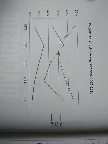
The graph below shows changes in the share of vehicle registrations of the three most common types of commercial vehicles in the US between 1970 and 2010.
Summarise the information by selecting and reporting the main features, and make comparisons where relevant.
The line graph illustrates the rate of vehicle registrations from 1970 to 2010 in three primary business vehicles in the US.
Overall, the majority of Americans enrolled in trucks. In addition, the percentage of truck and taxi registers followed an upward trend while the reverse was seen in the share of bus enrollments.
In particular, commencing at approximately 50% in 1970, the figure for truck-registered users dropped significantly to 30% in the next ten years. Following this, it bounced back from 30% to 50% between 1970 and 2010. In contrast, the rate of bus registers, which underwent a threefold rise from 5% in 1970 to nearly 15% in the following ten years, fell drastically to below 5% in 2010.
In the meantime, the number of taxies registrations accounted for nearly 25% in 1970, after which it climbed sharply to above 35% in 1980. Subsequently, it plunged to 15% in 2000; thereafter, it recorded a noticeable rise of 20% in 2010.
(160 words)
Please help me to evaluate my writing skills, read and comment if it's possible, and please also give a score. Thank you in advance.

IMG_201019_161234.jp.jpg
