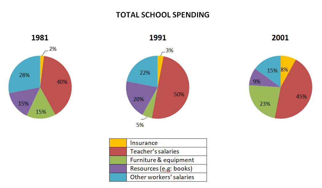
the percentage of expenditure of a UK school
The three pie charts below show the changes in annual spending by a particular UK school in 1981,1991 and 2001.
Summarise the information by selecting and reporting the main features, and make comparisons where relevant.
My writing
The three pie charts illustrate the percentage of expenditure of a UK school during the 1981, 1991 and 2001 period.
As can be seen clearly from these charts, while Teacher's incomes were spent the most, the reverse results were true for the Insuarance during the three year period.
To begin with, Teacher's salaries made up 40% in 1981. It accounted for half of total school budget in 1991 and later witnessed a slight decrease to 45% in 2001. There was a tiny increse of 1% to 3% in Insuarance spending from 1981 to 1991, which underwent a noticable growth to 8% ten years later.
As for Furniture and Equipment and Resources, both datas accounted for 15% at the beginning of the period. While the figure for Resources grew slightly to 20% in 1991, the expense for Furniture slipped sharply to 5% at the same time. However, the fund for furniture rocketed to 23% in 2001, whereas the figure for Resources saw a significant downward to 9%. Other workers' salaries witnessed declining trends throughout the period, with 28%, 22% and 15% in 1981, 1991 and 2001 respectively.

simu2_t2.png
