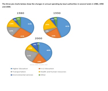
The pie charts give information in terms of the changes in spending by local authorities in some land in three different years (1980, 1990 and 2000). It can be seen from the charts that the higher education was the largest cost of local authorities, while transport and environmental service experienced increasing and there were gradual reducing in K-12 education and human resources.
In all of the three years, the largest expenditure was higher education which reached 40% in its percentage in the last period. But both of transport and environmental experienced a drop from 25% in the first period to become 18% in the last of the period.
On the other hand, outcome on K-12 education and health and human resources experienced slight reducing. K-12 eduction marked 25% in 1980 and then dropped down to 18% in 2000 and in health and human resources also showed slight reducing from 14% in 1980 to 10% in 2000, even though experienced an increasing in 1990 with marked 20% in its percentage.

digram_pie.jpg
