I am open for the grammatical correction
answer :
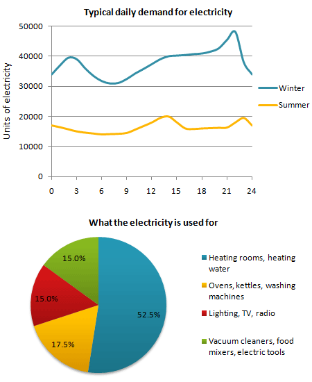
These two figures show regarding demand for electricity in UK during typical day. The depictory of line chart reported unit of electricity using during winter and summer, while the pie chart shows percentage of purposing using in electricity.
According to the line charts, Britons desire to use electricity in winter rather than summer. The electricity consumption fluctuated among 30-40 thousand units in first half of the winter, then reach a peak nearly 50 thousand units before felt dramatically onward. Nevertheless, electricity using in summer remained stable among 10-20 thousand. Both in the winter and summer, the low of trough of electricity usage occur before noon, but the peak routine come about evening.
The second chart represented what the electricity is used for. Around 15 per cent Britons use electricity for two groups; kitchen or entertainment, such as vacuum cleaner, food mixer, electronic tools, lighting, TV, and Radio. However, the more tripled per cent electricity using was for heating, either room or water, it was around 52,5 percent. The other residual percentage was used for oven, kettles, and washing machine.
In conclusion, both of data are coherence. The most favor electricity using is for equipments which function to make warm..

he_graph_below_shows.png
