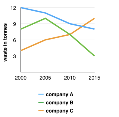
The graph below shows the amounts of waste produced by three companies over a period of 15 years.the quantity of produced waste by some companies
The illustration provides information on the figure for waste in tonnes made by three companies named A,B and C from 2000 to 2015.
It is clear from the graph that company A and B produced less waste between 2000 and 2015, whereas the amount of waste produced by company C grew gradually throughout the years.
In the first year 2000, the quantity of waste that company A made began at precisely 12 tonnes, the highest level compared to company B and C, with the figure for waste being a bit lower than 9 tonnes and slightly over 3 tonnes respectively. This amount of company A declined gradually over 15 years, reaching about 11 tonnes in 2010 and slightly under 9 tonnes in the last year 2015. With the same downward trend, Company B's amount of waste dove over 15 years and reached exactly 3 tonnes in 2015 apart from a brief rise of nearly 2 tonnes from 2000 to 2005.
In sharp contrast with the other two companies, the quantity of the produced waste from company C saw an upward trend throughout 15 years. There was a slow rise in this figure of 3 tonnes in 2005 and approximately 2 tonnes in 2010, until it reached a peak of 10 tonnes in 2015.

The graph
@Red Moon
your writing has explained the graph in a good way. My advice is you could add more information in the last paragraph about the average waste each company produced in 15 years. Since it would show the real difference
Putri, I must commend your effort in interpreting the information on the chart provided. You also did a nice job in paraphasing the prompt. However, there is a sgnificant note you must take so as perfect your ability to do justice to IELTS Task 1 during the real test. For this kind of chart, it is needful that you take cognisance of the scale used in plotting the graph. This action will enhance your specificity when commenting on the content of the graph. That way, you will avoid such expressions as '...slightly under 9 tonnes in the...' ''...a brief rise of nearly 2 tonnes from...'' '...a bit lower than 9 tonnes and slightly over 3 tonnes...' which, to some extent, create ambuiguity. For instance, the scale of the graph in your post is more like 3cm = 3units. So you could say that the waste generated in company A, for example, decreased from 12 tonnes to 8 tonnes over 15 year period from 2000 to 2015. You can see that my version of the expression is more straightforward and comprehendable than '...slightly under 9 tonnes in the...'. You can revisit the graph and try to infer the exact amount of the wastes generated across the three companies and how they changed overtime. Overall, you really have an eagle eye in noticing even less significant changes. Your score should be at least 5.5 for this version of your post.
I beleive your writing was well organized, perhap you should add a bit more information to para 2 (i'm not sure about this, just my opinion)
@Red Moon
I think that you had some problems about the way to express your ideas such as:
You wrote ''The illustration provides information on the figure for waste ...''. I mean it lost an important infomation . You know you'd better show the name of graph to the judges. If I were you, I will paraphrase the introduction like '' The line graph illustrates how much waste three companies A,B and C produced in terms of tonnes between 2000 and 2015''
With the summary, as you see, the amount of waste that company B produced accelerated to roughly 10%, then it experienced a sudden fall to ... So you could not suppose that : ''It is clear from the graph that company A and B produced less waste ...''Personally, it is not correct in some aspects.
eddies [Contributor]
25 / 1170 Hi there..., let me show you how I group the data based on the trend showed. Hope this helps you :D
This graph presents tonnes of waste produced in three different companies for every five years, from 2000 to 2015. The amounts of waste created from Company A and B showed dramatic decreases. This contrasted to the waste product of the Company C increasing gradually.
After reaching a high of 12 tonnes in the first year, the amount of waste produced by Company A continued to decline dramatically to the 2000 company's B figure. As it can be seen in the Company B, the amount of waste generated rose gradually in the initial year, but the converse would be true for the following years and then hitting a low of 3 tonnes over the ten-year period.
Although company C was close behind when it came to waste product in the 2000, this trend showed an upward trend from 4 to 6 tonnes in first 5 years and then continuously rose to overtake the figures for Company A and C in years of 2010 onwards.
@Red Moon
As my opinion, there are many unnecessary words, leading to incoherence in your essay
For ex: It is clear from the graph that company A and B
In the first year 2000
This amount that of company A
the other two companies
@Red Moon
In my opinion, perhaps at the beginning, you can make a grouping between B and C which have a similar rising pattern in 5 years then you also mention the exception C decreased dramatically. Then, you are able to explain "A" as the contrast one. Furthermore, you can explain about the comparison of all.
Thanks for your advices. I will try to write a better essay next time. Hope that you can also help me next time.

