Unanswered [4] | Urgent [0]
  

Home / Writing Feedback   % width   Posts: 2


Topic: The graph below shows the differences in wheat exports over three different areas.


vuthanhhoa 1 / -  
Oct 11, 2017   #1

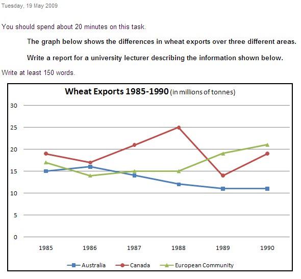
wheat exports 1985-1990


The graph compares the amount of wheat exported by Australia, Canada and European Community from 1885 to 1990.
Overall, it can be seen that there was a fluctuation in the number by all three areas. However, after the middle of 1988, European Community overtook the others as the largest wheat exports.

Turning to details, in 1985, 15 million tons is exported on wheat by Australia, which is the lowest amount in all areas. Regarding Canada and European Community, the figure were little similar, at about 17 million tons and 19 million tons, respectively. Despite some fluctuations, Canada's wheat exports continued to be higher than by others through three years. By 1986, it started to rise significantly and reached a peak at 25 million tons in 1988 while the figure for Australia and the other were only at over 12 million tons and 15 million tons respectively.

After that, there was a dramatic change that the total number of wheat exported by Canada rapidly decreased and dropped to its lowest point in 1989, at under 15 million tons before increasing again. As for Australia, there was a similar trend when the figure continued to go down to around 11 million tons and remained at this point until 1990. In contrast, European Community's exports experienced a gradual increase and reached the highest point at over 20 million tons in 1990.

  • IELTSWritingTask1.jpg


Holt  Educational Consultant - / 15391  
Oct 12, 2017   #2
Vu, you will be losing points for task accuracy with your presentation. Your summary overview at the beginning is incomplete. Without a proper overview or summary of the forthcoming discussion, you have created an essay that does not have a proper outline and also, does not accurately inform the reader of the information to come and who the target audience for the presentation is. Normally, the proper presentation for this outline would have been:

A graph has been presented for a summary report. The summarized information shall be presented to a university lecturer for his consideration. The data that was taken from the chart for presented include...

As you can see, a simple adjustment of the content of the statement you presented would have garnered you a higher TA score which, in the process, will also boost your remaining score considerations.


Home / Writing Feedback / Topic: The graph below shows the differences in wheat exports over three different areas.
Need Writing or Editing Help?
Fill out one of these forms:

Graduate Writing / Editing:
GraduateWriter form ◳

Best Essay Service:
CustomPapers form ◳

Excellence in Editing:
Rose Editing ◳

AI-Paper Rewriting:
Robot Rewrite ◳

Academic AI Writer:
Custom AI Writer ◳