Please feel free to comment your opinions and help me improve my score!
Thanks a lot.
Summarize the information by describing the main features of the charts and making comparisons where appropriate.
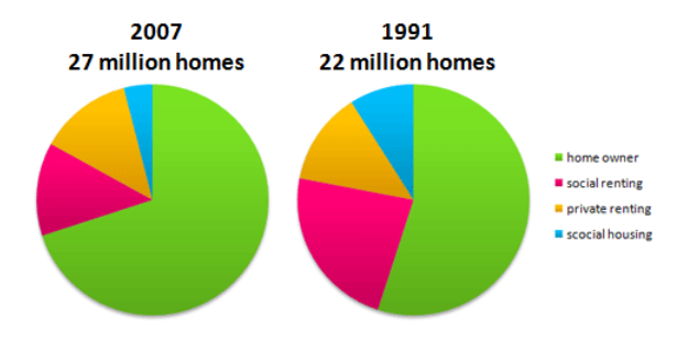
The two pie charts given illustrates the comparison of the percentage of housing owned and rented in the UK between 2007 and 1991.
In general, in both of the years, the home owner took the main part from the total number in 1991 and 2007: 22 million and 27 million homes respectively. Moreover, other types such as social renting, private renting, and social housing were also reported significantly.
In 1991, the home owner just accounted for over a half but then the number increased to nearly 75% in 2007. Actually, this type was the most popular over the period. Nevertheless, social housing had the smallest usage with about 15%. In 2007, the number even had a downtrend to one-third.
Besides, private renting and social renting kept a stable speed in declination and expansion. In 1991, the percentage of social renting was a quarter, however, had a dramatic fall to nearly 20% over the period. In contrast, the number of private renting slightly increased while it started at under 20% and then to 25% in 2007.
Thanks a lot.
The pie charts below show the percentage of housing owned and rented in the UK in 1991 and 2007.
Summarize the information by describing the main features of the charts and making comparisons where appropriate.
The two pie charts given illustrates the comparison of the percentage of housing owned and rented in the UK between 2007 and 1991.
In general, in both of the years, the home owner took the main part from the total number in 1991 and 2007: 22 million and 27 million homes respectively. Moreover, other types such as social renting, private renting, and social housing were also reported significantly.
In 1991, the home owner just accounted for over a half but then the number increased to nearly 75% in 2007. Actually, this type was the most popular over the period. Nevertheless, social housing had the smallest usage with about 15%. In 2007, the number even had a downtrend to one-third.
Besides, private renting and social renting kept a stable speed in declination and expansion. In 1991, the percentage of social renting was a quarter, however, had a dramatic fall to nearly 20% over the period. In contrast, the number of private renting slightly increased while it started at under 20% and then to 25% in 2007.

screenshot_159789754.png
