reasons for travel and public travel issues
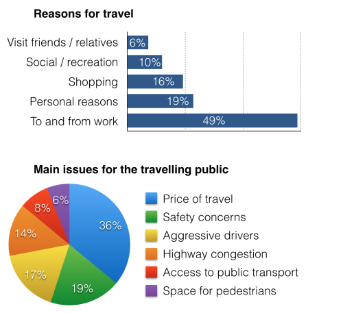
The bar chart illustrates the percentages of various reasons why people travel and the pie chart indicates the proportions of six major problems about travelling public in the US in the year 2009.
Overall, It is clear that work was the most popular reason of travelling. It is also noticeable that people living in America had difficulty in considering the price of travelling.
Looking at the bar chart more details, the proportion of to and from work was the highest, with 49%. While, visiting friends or relatives accounted for the lowest percentage, only 6%. The figures for social or recreation, shopping and personal reasons were significantly than that of to and from work, with 10%, 16% and 19% respectively.
In terms of major problems, price was the most popular issue, which took up the highest rate, at 36%. Meanwhile, the ratio of space for pedestrians was six times lower than that of price, only 6%, compared to Access to public transport, at 8%. The figures of three remaining categories were 1.8 times lower than that of Price for travel, with 14%, 17% and 19% respectively.

6a0120a5bb05d8970c01.png
