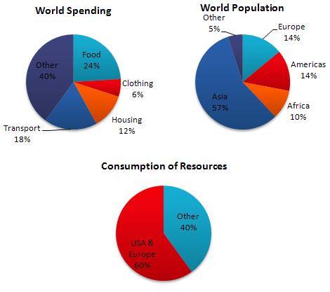
The pie charts below show World Spending, World population and Consumption of Resources.
Pie charts portray comparison between amount of the resource consumption, world population, and world spending, and are measured on percentage. Overall, it is immediately apparent that Asia is the region containing the largest population. Most of the world resources are consumed by USA and Europe, while the most world spending comprise food and transportation.
According to data illustrated in pie charts, the largest world population occupy Asia region, which almost reach three-fifths world population. Following this, America and Europe population are equal, each other at 14%. Afterwards, Africa is occupied by 10% world population, and the rest 5% populate the other region.
Even though both Europa and Americas are inhabited by less than fifth world population, more than half resources are spent in those regions. By comparison, other regions just spend two-fifth the world resource.
Furthermore, the bar chart depicts that two main word spending are food and transportation, at 24% and 18% respectively, followed by housing at 12% and clothing 6%. The rest of world spending is others at 40%.

TABEL_PIE_CHART_ESSA.jpg
