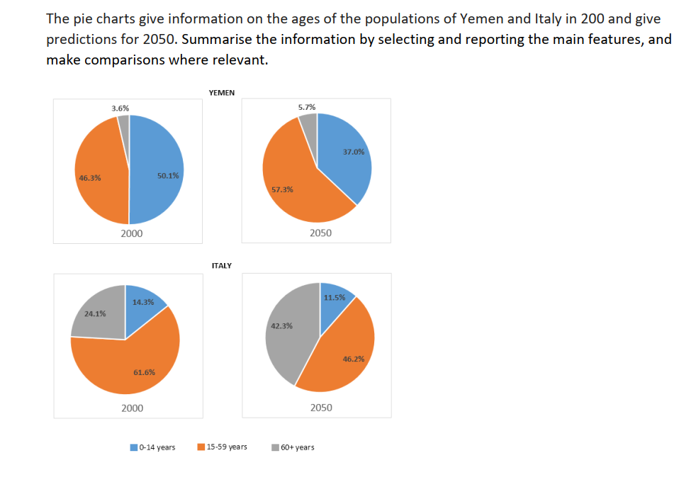
The charts illustrate the percentage of three different age groups in two countries Yemen and Italy in 2000 and the projections for 2050.
Generally speaking, there was more percentage of young people in both countries in 2000 whereas more people getting older in 2050.
In 2000, almost the whole population of Yemen consist of people under the age of 60 with 96.4%, and only 3.6% of the elder who has more than 60 years old. While in Italy, nearly one-fourth of the population (24.1%) is elder who has 60 years old plus and another three-fourths of Yemen is below the age of 60.
In 2050, the Yemen population is predicted to increase in the group ages 15 to 59 years old, more than 60 years old, and decrease in the group age of under 15 years old with 57.3%, 5.7%, and 37.0 % respectively. Besides, there will be a significant rise in the proportion of Italy's population of the group age 60 years old plus from 24.1% to 42.3%, and a fall in the percentage of Italian who is below 60 years old.

piechart2.png
