j0NZICH
Oct 7, 2021
Writing Feedback / The chart illustrates the amount of international students in the USA and from where they came [2]
IELTS TASK 1
(I wrote only first chart so there is no information about subject)
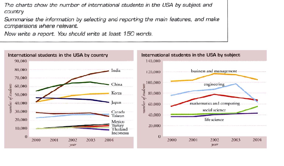
The chart illustrates the amount of international students in the USA and from where they came during the period of four years.
Overall, the amount of Indian students is the highest whereas the amount of students from Mexico, Turkey and Thailand and Indonesia is the lowest and have not experienced any changes.
In 2000 USA saw large increase in the amount of students from India whidh overtook both Korean and Chinese students reaching 80.000 from 40.000 in four years. The figure for students from Japan and Taiwan declined with 10.000 less students in the end for both countries respectively.
Other counties including Thailand, Mexico, Turkey and Indonesia stayed the same with the exception of students from Korea where it saw tangible rise from 40.000 to 52.000 approximately.
IELTS TASK 1
The chart shows the number of international students in the USA by subject and country
(I wrote only first chart so there is no information about subject)
The chart illustrates the amount of international students in the USA and from where they came during the period of four years.
Overall, the amount of Indian students is the highest whereas the amount of students from Mexico, Turkey and Thailand and Indonesia is the lowest and have not experienced any changes.
In 2000 USA saw large increase in the amount of students from India whidh overtook both Korean and Chinese students reaching 80.000 from 40.000 in four years. The figure for students from Japan and Taiwan declined with 10.000 less students in the end for both countries respectively.
Other counties including Thailand, Mexico, Turkey and Indonesia stayed the same with the exception of students from Korea where it saw tangible rise from 40.000 to 52.000 approximately.

132195_1_o.jpg

