Please help me to asses my writing, thank you
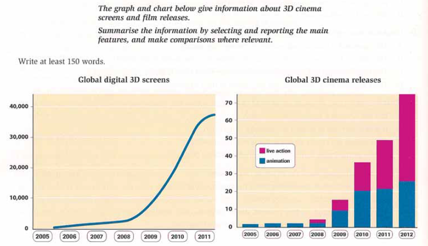
The given line graph illustrates the number of screen especially 3D cinema while the bar chart depicts the number of movies that release (live action and animation) during 2005 to 2012. At the first glance, the increase in 3D screens worldwide are marked by the raise of 3D film releases and both of them have an upward trend.
It can be seen clearly that the number of screens especially 3D cinema stood at approximately below 1,000 in the end of 2005 and was going to increase gradually to just over 2,000 in the last 2008. The most interesting fact is that between 2009 and 2011, there was a sharp increase in 3D screens from 5,000 to almost 40,000 and they reached a peak at the end of 2012.
Moreover, the trend of bar graph had a similar trend with the line graph. Animation films in 3D began at 2005 which had 2 films release until 2007. Between 2008 and 2012, the animation started to increase gradually from 5 to just over 20 movies release. On the other hand, 3D live action film became well-known during 2009 to 2012 and these were soaring from 20 to just over 70 respectively.
3D technology during 2005 to 2012
The given line graph illustrates the number of screen especially 3D cinema while the bar chart depicts the number of movies that release (live action and animation) during 2005 to 2012. At the first glance, the increase in 3D screens worldwide are marked by the raise of 3D film releases and both of them have an upward trend.
It can be seen clearly that the number of screens especially 3D cinema stood at approximately below 1,000 in the end of 2005 and was going to increase gradually to just over 2,000 in the last 2008. The most interesting fact is that between 2009 and 2011, there was a sharp increase in 3D screens from 5,000 to almost 40,000 and they reached a peak at the end of 2012.
Moreover, the trend of bar graph had a similar trend with the line graph. Animation films in 3D began at 2005 which had 2 films release until 2007. Between 2008 and 2012, the animation started to increase gradually from 5 to just over 20 movies release. On the other hand, 3D live action film became well-known during 2009 to 2012 and these were soaring from 20 to just over 70 respectively.

1.png
