Unanswered [0]
  

Home / Writing Feedback   % width   Posts: 4


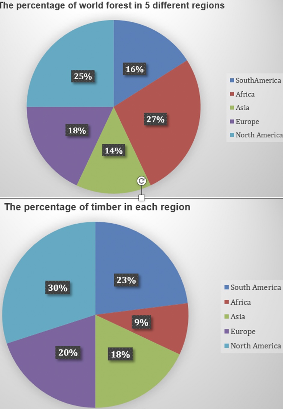
The charts give information about world forest in five different regions.


tea555 1 / -  
Nov 19, 2022   #1

world forest - the pie charts


The given pie charts compare the proportion of forest in five different continents as well as the production of timber in each region.
Overall, the forests in Africa accounted for the largest proportion of the world's forest while the smallest forest coverage is found in Asia. Additionally, timber produced in North America holds the greatest share of the world's timber whereas the opposite is true for Africa.

In terms of forests, North America and Africa take up the vast majority of forests in the world, at 25% and 27% respectively. The percentage of forest that South America, Europe, and Asia make up is almost the same, at 16%, 18%, and 14% respectively.

According to the second pie chart, around 30% of the world's timber output comes from North America. Despite having the largest proportion of forest, Africa constitutes a negligible amount of timber, at only 9%. Meanwhile, timber in South America, Asia, and Europe comprise 23%, 18%, and 20% of the world's timber.

  • 67D726D10EE84717B.jpeg


Holt  Educational Consultant - / 15461  
Nov 19, 2022   #2
Always remember that the number of images provided helps to add to the accuracy of the short form information presentation. That means, do not just identify these as pie charts, indicate 2 pie charts. Then use a different sentence to identify the information being provided per chart. That way the reader will know how to divide the information based upon the summarized information. Additionally, oen should never use a single sentence for the summary overview. While this may be presented within 2 sentences, it would be better to blend that into the trending discussion, rather than presenting the trend as a stand alone presentation. The summary overview needs to be at 5 sentences long maximum anyway. Maximize the TA scoring potential for the first paragraph at all times by using the correct presentation format.

The essay could have been better analyzed if the writer opted to write at least 3 sentences, as required, for each analytical paragraph. Since this is 2 image presentation, the discussion could have even been extended to a 200 word count composed of a 4 paragraph presentation. The current presentation is not going to be considered fully developed, analyzed, or explained. It is not going to get a good C+C score in the end because of this.
Matt1313 4 / 7  
Nov 26, 2022   #3
"world's forest while the" there needs to be a comma before while in this situation.

You pointed out that 14% 16% 18% is almost the same while no such comparison is made in others . Best if you put the words similar rather than same in here.

Vocabulary is not as varied as it should be.
ditmemay 2 / 2  
Nov 27, 2022   #4
There is insigficant repetition in your essay in terms of words and the first body of the passage is slightly shorter than the overview.


Home / Writing Feedback / The charts give information about world forest in five different regions.
ⓘ Need Writing or Editing Help?
Fill out one of these forms for professional help:

Best Writing Service:
CustomPapers form ◳

Graduate Writing / Editing:
GraduateWriter form ◳

Excellence in Editing:
Rose Editing ◳

AI-Paper Rewriting:
Robot Rewrite ◳