Unanswered [1]
  

Home / Writing Feedback   % width   Posts: 3


These charts provide an overall view of how the usage of water varied among six regions on Earth


Phuongnguyen256 7 / 12  
Jul 3, 2018   #1

WATER CONSUMPTION


The charts below show the percentage of water used for different purposes in six areas of the world.
Summarise the information by selecting and reporting the main features, and make comparisons where relevant.
Write at least 150 words.


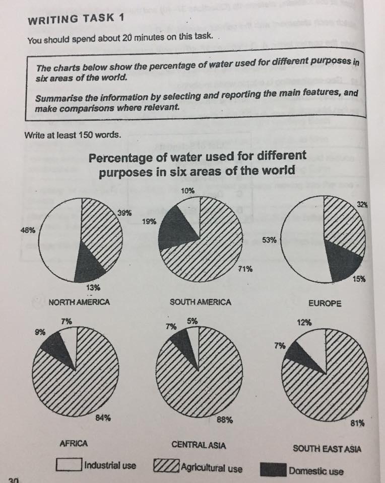
The six charts provide an overall view of how the usage of water varied among six regions on Earth (namely, North America, South America, Europe, Africa, Central Asia and South East Asia) with regards to three industries comprising industrial, agricultural and domestic sectors.

As can be seen from the charts, there are four areas (South America, Africa, Central Asia and South East Asia) where the usage of water in agriculture accounted for the biggest share of each total water consumption. These places, however, recorded substantially inferior contribution of water to both industrial and domestic sectors in proportion to that of Europe and North America.

First, it is evident from the information provided that Europe and North America were the two areas with the largest percentage of water use for industrial purpose-53% versus 48%. Africa and Central Asia were on the list as well, however, amounted for the smallest share, 7% and 5% respectively. On the other hand, Europe and North America reached the low end of the ranking in agricultural use, taking up 39% and 32% separately, while Central Asia ranked first at 88%. As for the two mentioned usages of water, the third and fourth place always belonged to South East Asia and South America.

Moreover, we can observe that domestic sector in both Central Asia and South East Asia received the same lowest 7% of water overall. Otherwise, South America was domestically supported by the most significant water volume which equalled 19%. In addition to the greatest industrial water use, domestic water concentration was also remarkable in Europe and North America as their amount of water consumed by households followed closely behind South America's, having 13% to 15% in relation to each total.

I'd be so grateful if you do estimate my IELTS band score on this writing task 1.

  • 36543874_19913836077.jpg


thuhuyen461 5 / 6  
Jul 7, 2018   #2
domestic sector in ... same lowest 7% of water overall. -> the amount of water required to meet living demand in residential areas of both Central Asia and South East Asia accounted for the lowest of all regions with 7%.

... water volume which equalled , taking a 19% share of grossing water used.

use different phrase:
account for=take up=take a % share of
in agricultural use= meet agricultural need/ requirements/ demand/ urge (for water)= for farming/cultivation/ crop production/ husbandry= to cultivate/farm/produce crops
industrial use= manufacturing purposes
Holt  Educational Consultant - / 15461  
Jul 8, 2018   #3
Viet, always time yourself when writing your essay. You have only 20 minutes for this task. That means you should leave at least 5 minutes towards the end for proper editing and finalization of your essay before submission. Writing 287 words indicates that you are not leaving any time at all for essay correction on your end. That can spell a disaster for you in the actual test. Write no more than 200 words for this type of essay in order to give you editing time. Believe me, in the actual test, you will not have the time to write 287 words like you did in this essay.

As I reviewed your essay for content, I noticed that you did a good job in presenting the chart information except for a few sections. You did not properly identify the image provided, there is no trending statement, and you placed pertinent information in a parenthesis. These all add up to create some major errors on your part.

The trending statement is located at the end of the opening summary. This sentence indicates the concluding result of the illustration(s) provided. This is meant to show the development of the countries and who used the most water in terms of percentage in the chart. Since this sentence can be placed anywhere in the essay, even at the end of the presentation in the form of a concluding paragraph, I was hoping that you would have presented it somewhere here. I guess you were focused so much on just typing in English that you neglected to remember the importance of presenting all of the required elements in the essay.

While there were 6 charts presented in the essay, you failed to identify the kind of chart that was presented. This is part of the TA consideration of your essay so when you just say "chart" as opposed to "pie chart", which was the chart presented, you will lose points for inaccuracy. There are several types of charts, so you need to be specific about what chart was presented in your report. It helps to create the analytical thought process that can help with your C&C increased scoring.

The countries indicated should not be placed in a parenthesis. That is because these countries are a major part of the discussion and yet, you placed it in what is known as an optional format. The parenthesis means it is not part of the discussion but is worth mentioning anyway. Since the 6 countries are an integral part of the discussion, you should have simply listed these countries as part of the paragraph presentation.

Due to the problems that I indicated above, I do not feel that it would be fair to score you on this essay. It's imperfections will not bring in an acceptable score for you. So I will instead, give you another chance to write a Task 1 essay in a proper manner and then I will score that one for you.


Home / Writing Feedback / These charts provide an overall view of how the usage of water varied among six regions on Earth
ⓘ Need Writing or Editing Help?
Fill out one of these forms for professional help:

Best Writing Service:
CustomPapers form ◳

Graduate Writing / Editing:
GraduateWriter form ◳

Excellence in Editing:
Rose Editing ◳

AI-Paper Rewriting:
Robot Rewrite ◳